B&K Design and Construction
Brian Albrecht runs B&K Design and Construction out of Royse City, Texas. Five stars across twenty-six Google reviews, a Map Pack listing that already ranked, and a business built on referrals from people who had seen the work in person. What the business did not have was a website, so every search that found the listing had nowhere to land. I built the whole funnel: a quote-grade intake tool that turns phone photos into a lead he can actually act on, a page-per-service and page-per-city architecture where there had been one services page, and a hand-drawn architectural film sitting behind every page on the site.
The intake tool is the product. A homeowner photographs the job on their phone, answers four screens, and Brian can size up the work before deciding whether it is worth the drive. Behind it, twenty-three pages that each carry their own hand-drawn architectural film, generated by a bespoke drawing engine rather than bought from a stock library.
The Client
Brian Albrecht owns B&K Design and Construction in Royse City, Texas. He is a design-build remodeler and handyman: kitchens, bathrooms, flooring and tile, carpentry and built-ins, fencing, decks, doors, roofing, and the long tail of repairs that a homeowner has been putting off. His own words for the business are faith-driven, quality work, honest values, and the Google reviews read like people quoting him back to himself. The reputation was already there. Five stars across twenty-six reviews is not something a website produces; it is something twenty-six households decided independently after watching someone work in their house. He serves the Royse City, Rockwall, Fate, Heath, Caddo Mills, and Greenville corridor on the east side of the metro, plus the greater DFW area beyond it.
A Listing With Nowhere To Land
Brian's Google Business Profile was doing the hard part already. It ranked, it carried the reviews, and it put the business in front of people searching for a remodeler in his corridor. The website field on that profile was empty, because there was no website to put in it. What stood in for one was a single social card: a link that listed his phone number and his Instagram. That is a specific, fixable gap, and it is worth naming precisely rather than dramatizing. The traffic engine existed and worked. The thing it should have been pointing at did not. Every person who found the listing, read the reviews, and decided they wanted to talk to him had exactly one option, which was to call a stranger cold. Some people will do that. Most people, at nine at night, looking at a kitchen they hate, will not. They will keep scrolling to the contractor whose site lets them start the conversation without a phone call. So the brief was never 'make a brochure.' It was: build the thing the listing should have been pointing at, and make the first step something a person will actually take.
The Intake Tool
Brian's own first ask, before any conversation about design, was for a tool that would let him understand a job before driving out to look at it. That is the real economics of a small remodeling business. An unqualified site visit costs an hour of driving plus an hour on site plus the job he was not doing instead, and a meaningful share of them end with a homeowner whose budget and whose project were never going to meet. So the intake is the centerpiece, not the contact form. It is a four-step wizard, built mobile-first because that is where the traffic comes from. Step one is what the project is. Step two is scope, timeline, and a budget band. Step three is photographs, taken on the spot with the phone's camera or dragged in from the roll, with previews so the person can see what they sent. Step four is where the property is and who to call. The fields were engineered backwards from a single question: what does Brian need in order to know what he is walking into? Not what does a form usually ask. The budget band is there so nobody's time gets spent on a mismatch. The photos are there because a picture of a bathroom answers more questions than a paragraph describing it ever will. The site still promises a real number only after a real walkthrough, and that promise is kept. The intake is not a quoting engine and was never sold as one. What it does is decide, before anyone gets in a truck, which walkthroughs are worth booking and what to bring to them.
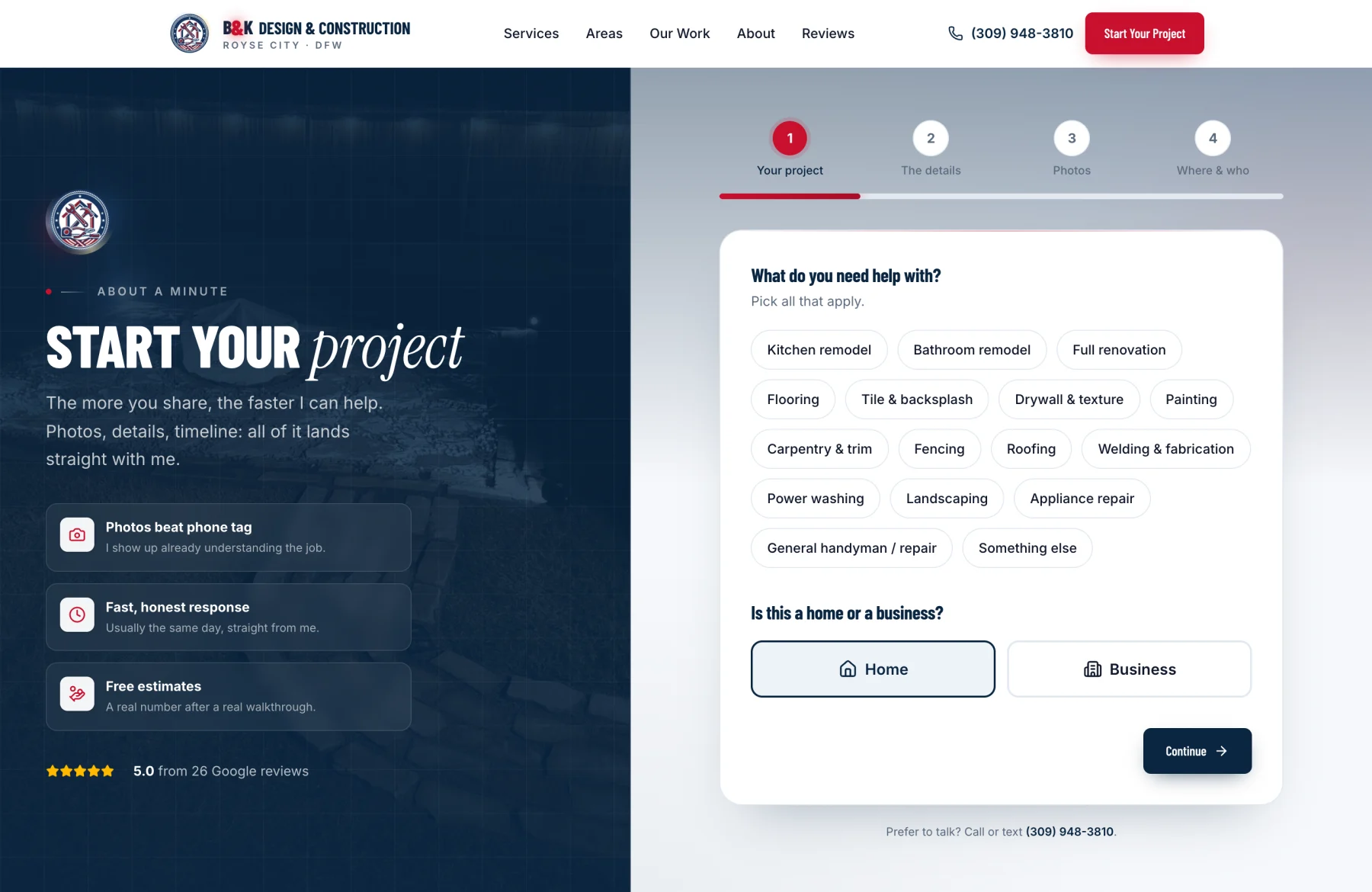
The design question underneath the wizard: how much can you ask before a person quits. Every additional field costs completions. The standard answer is to ask for as little as possible, capture the email, and qualify later on the phone. I rejected that here, because 'qualify later on the phone' is precisely the labor the tool exists to eliminate, and because a lead that arrives as a name and an email has moved the work rather than done it. The resolution is that the expensive question is not the number of fields, it is the number of DECISIONS. Four screens with a clear finish line reads as shorter than one long page with the same fields on it, because the person can see the end. Project type is a set of taps, not a text box. Timeline and budget are bands, not free entry, so nobody has to commit to a number they do not have. The only real typing is the address and the contact details, at the end, once the person has already invested three screens and is unlikely to abandon. The photo step is the one that earns its cost. It is also the one most likely to fail, because uploads on a phone on a bad connection fail constantly. So the images are compressed client-side before they leave the device, they upload to object storage rather than riding the form submission, and each one shows a preview so the person can confirm it arrived. The failure mode I built against: a lead that is silently lost. If the mail provider is down, the submission still validates, the photos are still stored, and the lead is still recorded. The person still sees a confirmation, because from their side nothing failed. The alert catches up. A form that says 'something went wrong, try again' to a homeowner who just spent four minutes photographing their kitchen has spent that goodwill for nothing.
The Sixty Seconds After Submit
The moment a form is submitted is the only moment where the prospect's attention is guaranteed. Almost every small contractor spends it on a page that says 'thanks, we will be in touch.' Submitting the intake fires two messages at once. The prospect gets a branded reply that confirms exactly what was received and tells them what happens next, so the silence between submitting and hearing back is a known quantity instead of a worry. Brian gets a structured alert carrying every field, the photographs as thumbnails he can open, and one-tap call and text links for the number the person just gave him. The reply-to on his alert is the prospect's own address, so answering the email answers the customer. That last detail is small and it is the one that changes behavior. Brian can be standing on a job site, open the alert, look at four photos of a bathroom, see the budget band, and reply from his phone in under a minute without switching apps or copying a phone number by hand. Speed is the entire competitive advantage available to a one-person shop against a company with an office manager, and it is won or lost in interface design.
A Constraint That Shaped The Architecture
Texas regulates how contracting work may be advertised, and the rules bite before any work is performed. An advertisement that names plumbing has to carry a Responsible Master Plumber license number. An advertisement that names electrical work has to carry a TDLR contractor license number along with a specific TDLR notice. Roofing, by contrast, requires no state license in Texas at all. So those two words appear nowhere on this site, in any framing, including the softer constructions that sound like they sidestep the issue. That decision was made deliberately and it cost real search volume, because they are high-intent terms a keyword tool would put near the top of any list. The more interesting consequence is what it forced. Rather than describing the site's coverage as a list of trades, the copy speaks about the team and the finished result: one point of contact, one crew, one person accountable for how the room looks when it is done. That reads better than a trade list would have anyway. It is a good reminder that a constraint arriving from outside the design brief will often improve the work, provided you treat it as a design input rather than an obstacle to route around.
Twenty-Three Pages Where There Was One
The first version of the site had a single services page carrying roughly twenty distinct searches on its back. That is the most common structural mistake a small business site makes, and it is invisible until you look at who is outranking you. Every competitor ahead of B&K in the corridor ran a page per service and a page per city. So the site now does too. Ten service pages, one each for kitchen remodeling, bathroom remodeling, whole-home remodeling, flooring and tile, carpentry and built-ins, fence installation, decks and patios, doors and exteriors, roofing, and handyman work. Six city pages for Royse City, Rockwall, Fate, Heath, Caddo Mills, and Greenville, plus an index that ties them together. Twenty-three indexed URLs in total, against six before. Under each one: Service and FAQ structured data, LocalBusiness markup with the business's real name, address, phone, and hours, and breadcrumbs. The FAQs are built on native disclosure elements rather than JavaScript accordions, which means every answer ships inside the HTML where a crawler reads it instead of appearing only after a script runs. Page titles are written query-first, so the words a person actually typed sit at the front of the result rather than behind a brand name. One unglamorous fix worth naming, because it is so common: the sitemap had been stamping every page with the current date on every deploy, which tells a search engine that all twenty-three pages change every time anything ships. That is a claim a crawler learns to disregard. Now the dates are real.
Twenty-Three Hand-Drawn Films
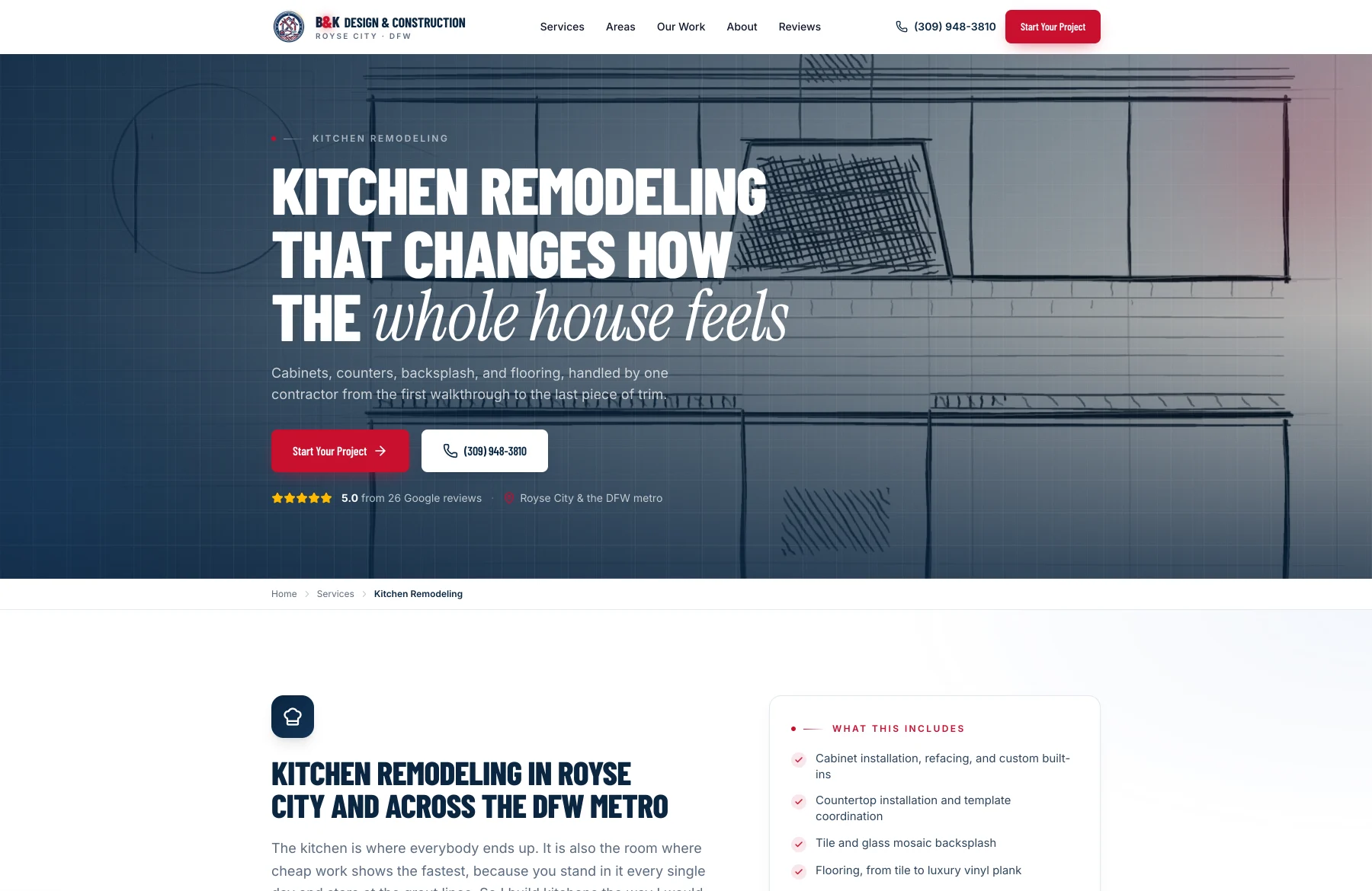
Every page on this site has an architectural pencil drawing behind its header, and the drawing draws itself. Not a stock illustration, not a Lottie file, not a photograph with a filter over it. Twenty-three separate films, one per page, produced by a drawing engine I built for this project. The engine works the way a draftsman does. Scenes set in the built world (a street corner in Rockwall, a lakeside deck in Heath, a Victorian wrap porch in Greenville, a roof plan, a receding fence line) are drawn through a true two-point perspective camera: the world is described in feet, the camera is level so vertical lines stay vertical, and the vanishing points are correct by construction rather than eyeballed. Scenes that a draftsman would honestly draw flat, like a kitchen elevation, a stair section, or a door schedule, stay orthographic on purpose. Faking perspective on a drawing type that is never drawn in perspective is exactly the kind of detail that makes an illustration read as decoration. The animation is held on threes, the cadence hand-drawn animation actually uses. An earlier version had a per-frame line boil, and it read as jitter rather than as drawing, so it was cut. Shading is diagonal pencil hatch clipped to the shape it fills. Structural lines carry an overdraw echo, the doubled edge you get from a draftsman redrawing a line they have already committed to. All of it is grayscale ink on paper, sitting behind a navy wash, so it never competes with the words in front of it. Under a reduced-motion preference the film never starts and the fully drawn sketch stays as a still image, which is the honest fallback: the drawing is the point, the motion is the flourish.
The Crest
Brian brought his own emblem: a circular badge with a rope border, a house, crossed tools, stars, and a ribbon in red, white, and navy. It was his, it was on palette, and the right move was to keep it rather than to talk a client out of a mark he likes. What it needed was production work. I cleaned the artwork down to a true transparent background, trimmed and centered it on a square canvas, and built an animated version for the moments that deserve one. The animation took two attempts. The first rotated the rope twist, which was invisible, because a symmetrical rope looks identical while rotating. The version that shipped orbits a small gold light bead around the dark navy star band, where gold has contrast to read against, with a trailing glow behind it and a slow metallic sheen across the face. It runs when the crest scrolls into view and it stops entirely under a reduced-motion preference. The favicon is a separate mark, and that is a deliberate decision rather than an inconsistency. The full crest is detailed enough to turn into a smudge at sixteen pixels; I tested it and it does. So the browser tab, and any other sixteen-pixel context, gets a simplified circular house mark drawn from the same geometry, which stays crisp. The full crest is used everywhere it has room to be itself.
His Work, Not Stock
There is not a single stock photograph on this site. Every image is a job Brian actually did. The source material was his own social media, which is where the work had been documented and where it was going to stay unless someone did something with it. I pulled the full archive, removed the duplicates and the in-progress shots, and curated down to the finished work, then optimized the survivors for the web. Thirty photographs now carry the site. They are not confined to a gallery page, which is where portfolio photos usually go to be ignored. They run as a scrolling ribbon of recent work across the top of the homepage, as a featured carousel further down, as the backdrop behind the hero under a heavy navy wash that keeps the text crisp, inside the story on the about page, and one per service group on the services page in an alternating magazine layout. The work page organizes the rest into three category carousels. Every one carries specific, honest alt text describing what is actually in the frame. The purely atmospheric images are marked as decorative so a screen reader skips them instead of narrating a texture.
Measured, Including The Part I Left On The Table
Lighthouse, run against the live site rather than a local build: accessibility, best practices, and SEO all score 100, on desktop and on mobile alike. Cumulative layout shift is zero on both, which is the number a visitor actually feels, because it means nothing on the page moves under their thumb while it loads. Total blocking time is effectively zero. Desktop performance sits in the high nineties with a largest contentful paint around a second and a half. Mobile performance is the one score I did not take to the top. It lands in the mid eighties, and it is worth being direct about why rather than quietly omitting it. The largest element on a phone is the hand-drawn film in the header, and that film is what holds the number down. The path to a higher score was available and I know exactly what it is, because I measured it: serve phones a still poster or a much shorter film. I confirmed the fix works and chose not to ship it. On a real device over a real connection the page is quick; the deficit shows up under a simulated slow network penalizing the one element that makes this site look like nothing else in the corridor. That is a judgment call, not a technical limit, and the useful thing to say out loud is that the score is a proxy and the experience is the thing. I am happy to be held to both, which is why the number is written down here instead of rounded away.
The Result
The Google listing now has somewhere to send people. Twenty-three pages, each aimed at a specific search a homeowner in this corridor actually runs, each carrying structured data that tells a crawler what the business does and where it does it. A photo-first intake tool that lets a person start a conversation at nine at night without calling a stranger, and lets Brian judge from his phone which jobs are worth the drive and what to bring when he goes. Two emails in the sixty seconds after submit, one to reassure the customer and one to arm the contractor. And a site that does not look like the other contractor sites in the corridor, because twenty-three original architectural drawings and a cleaned-up version of his own crest are not things a template hands out. The reputation was already real. This is the surface that finally matches it.
The technical decisions behind this build.
Next.js 16 + React 19
App Router with static generation, so all twenty-three pages are prerendered HTML served from the edge. Every word a crawler needs is in the source, not assembled by a script after load. Deployed on Vercel with the apex domain redirecting to the canonical www form, so search authority consolidates on one address instead of splitting across two.
TypeScript + Tailwind CSS 4
Strict types from the site's data files through to component props, so a service page that references a missing photo or a broken slug fails at build rather than in front of a customer. Tailwind v4 carries a navy-led design system with red reserved for calls to action, verified at 360, 390, 768, 1440, and 1920 pixels with zero horizontal overflow on any route.
Vercel Blob
Project photographs from the intake tool upload directly to object storage rather than riding inside the form submission. That is what makes a multi-photo upload from a phone on a weak connection survivable, and it keeps large images out of the email path where they would bounce against attachment limits.
Resend
Two transactional messages on every submission: a structured alert to Brian with photo thumbnails, click-to-call, click-to-text, and reply-to set to the prospect, plus a branded confirmation to the prospect. The sending domain is authenticated with DKIM, SPF, and DMARC records so neither message lands in spam, which is the failure mode that quietly kills contractor lead flow.
Structured Data (LocalBusiness, Service, FAQPage)
Machine-readable identity on every page: what the business is, where it operates, which services it performs, and what questions it answers. The markup deliberately omits an aggregate rating, because the reviews are collected by Google and marking up third-party ratings as your own violates their guidelines. Doing that correctly matters more than the rich result it would have bought.
A Bespoke Drawing Engine
The twenty-three architectural films are generated, not licensed. A two-point perspective camera renders built-environment scenes with correct vanishing points from a world described in feet, while drawing types that are honestly flat stay orthographic. Held on threes, hatched, and rendered grayscale, with a fully drawn still frame as the reduced-motion fallback.
Built from zero and then hardened in focused passes: the intake tool and the core site first, then real photography pulled from the client's own archive, then a search architecture pass that took the site from six URLs to twenty-three, then the drawing engine and the films, then a performance and accessibility pass across every route, and finally the domain cutover with email authentication and analytics wired in behind it.