The Homepage Is the Tunnel
An express car wash is a subscription business wearing a retail costume: the chains that win convert drivers into unlimited members, and most of their websites still behave like brochures with a phone number. This brief builds the site as a conversion machine wrapped in the most cinematic thing the industry owns, the LED-lit tunnel itself. You scroll through the wash. You exit into daylight. And every surface after that is engineered to do the two jobs that matter: sell the membership and route the driver to the nearest gate.
The Business Under the Foam
Walk any express wash lot at 8 AM on a Saturday and you can read the business model in the two lanes: the pay-per-wash lane has a line, and the members lane doesn't slow down. Unlimited plans are the entire economic engine of this industry. A retail wash is ten to twenty-two dollars once; a member is twenty-two to forty-five dollars every month, forever, whether it rains or not. Operators who run multiple locations already know this. Their websites mostly don't.
The typical multi-location wash site is a brochure: a hero photo of somebody else's foam, a tier grid with no prices, a "coming soon" button where the signup should be, and one page listing every location like a phone book. The pattern is so consistent it defines the opportunity. A site that publishes its prices, signs up a member in ninety seconds, and gives each location a real page is not incrementally better in this vertical. It is playing a different sport.
So this brief starts from the operator's P&L, not from a mood board. Every design decision below is downstream of two jobs: convert drivers into unlimited members, and route local search traffic to the nearest gate.
The Signature: Scroll Through the Wash
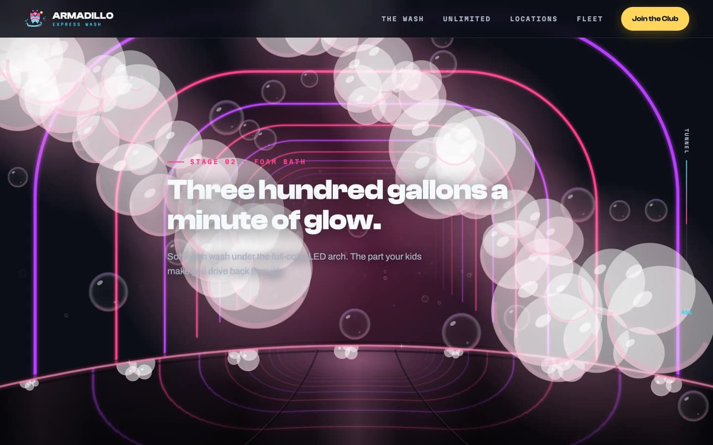
An express tunnel at night is one of the most cinematic retail environments in America, a hundred-foot light installation that families literally drive back through for fun. No template site uses it. The industry's own best asset sits unphotographed behind a stock image of a soapy sedan.
Armadillo Express opens inside the tunnel. The homepage is a scroll-driven ride rendered live on a canvas: neon arches rush past as you scroll, foam builds across the windshield, the color script moves from cyan pre-soak through magenta foam to the amber warmth of the wax arch, and a progress rail ticks off your position like a wash-bay controller. The whole ride is anchored to a driver's-eye hood in gloss black, a dark mass that mirrors the passing arches in real time, so you are not watching the tunnel so much as sitting in it. Each stage makes exactly one point, so the ride is the pitch. A tunnel is genuinely linear, which means scroll-as-sequence isn't a gimmick here; the structure of the interaction is the structure of the product.
The ride is built as a progressive enhancement. Kill JavaScript, or ask for reduced motion, and the same content renders as clean stacked sections. Nothing about the showpiece is allowed to cost the site its floor.
Dirty to Clean, Dark to Light
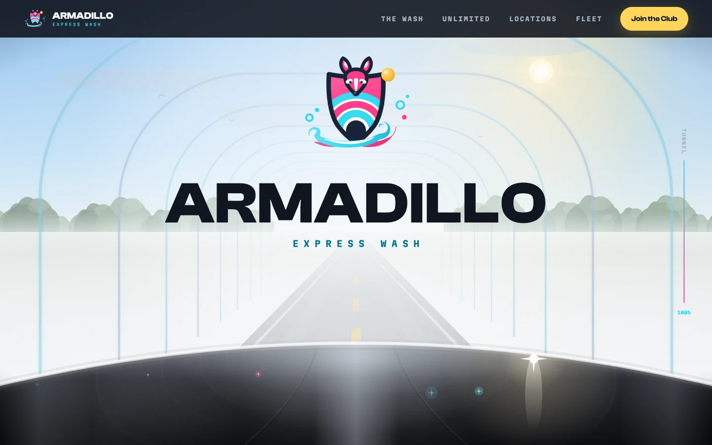
The site performs the product. The tunnel half is wet-dark neon; then the exit blooms to white and the entire page shifts into daylight, cool clean light, dark ink, chamois-yellow calls to action, exactly where a clean car rolls out into the Texas sun. The dirty-to-clean arc is the oldest promise in this business, and here the design itself makes it. The ride even resolves like the real thing: a green GO sign hangs at the mouth of the tunnel, and the blank white of the exit is where the brand finally arrives, the ARMADILLO wordmark rising letter by letter over a showroom-clean hood.
That arc is also a discipline. Half the page lives in daylight, which keeps the neon from curdling into a theme. The palette is drawn entirely from the subject's physical world: wet asphalt, foam, the magenta and cyan of LED arch lighting, and chamois, the microfiber-towel yellow that becomes the color of every "Join" button. Type does the same work: a heavy display grotesque for the headlines, a plain workhorse for the body, and a monospace reserved for what the site treats as telemetry, temperatures, hours, plate numbers, wait states, because an express wash is a machine that runs on rails and the interface should sound like one.
Prices on the Table
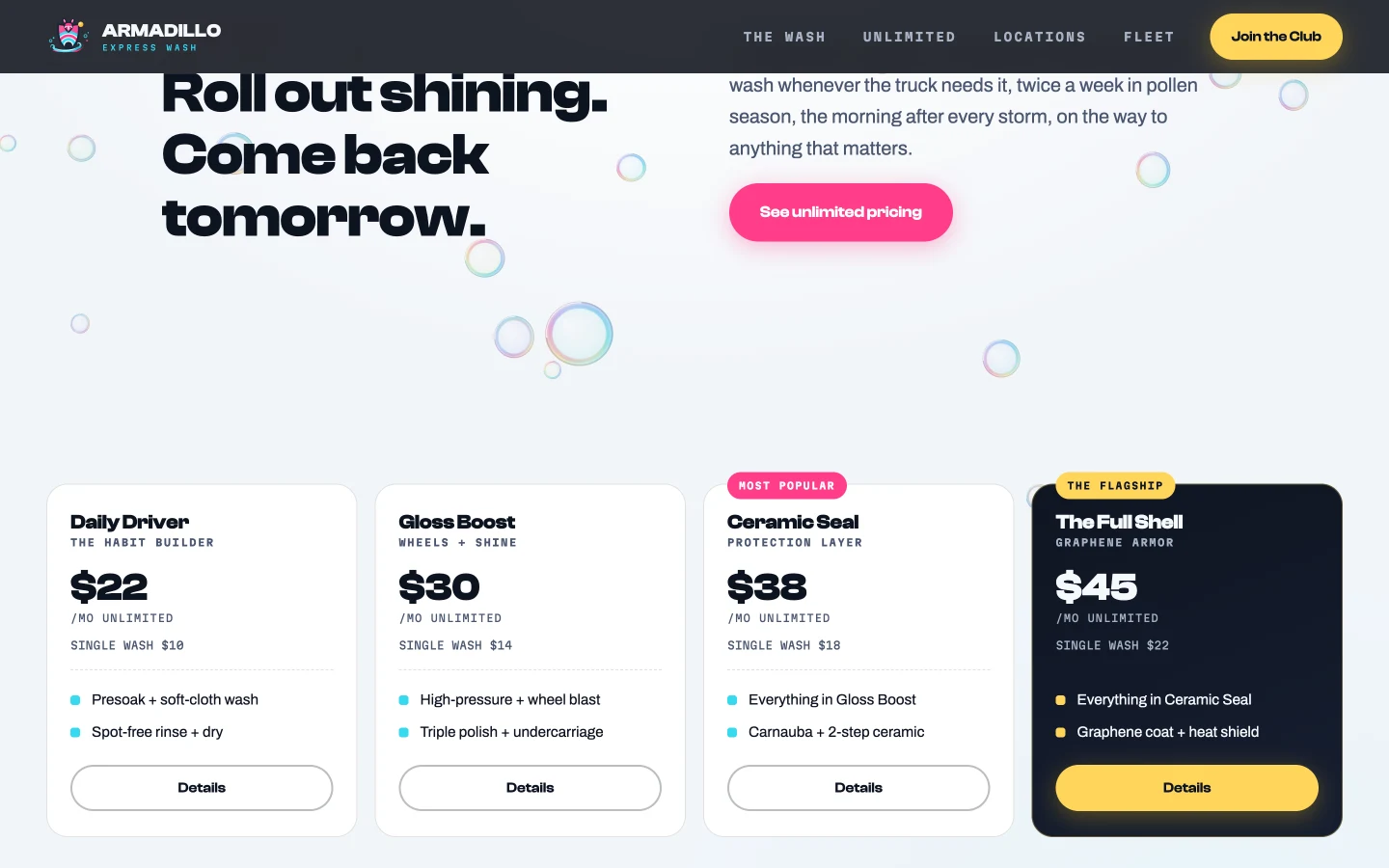
The vertical's strangest habit is pricing shame. Tier grids with feature lists and no dollar amounts, as if the number were negotiable at the pay station. Every operator knows the prices; every competitor knows the prices; only the customer standing in Google is kept in the dark, and dark is where conversions die.
Armadillo publishes all four tiers with both numbers, single wash and unlimited, on the homepage and again on the membership page with the breakeven stated in plain mono type: breaks even at three washes. The flagship tier is where the fictional brand earns its name. The armadillo is the animal that solved protection by wearing armor, so the ladder ends at The Full Shell, a graphene top coat rendered as the one dark card in a light grid. The brand mark itself is three nested shell bands that read equally as tunnel arches, which is the kind of coincidence you only find inside the subject's own world.
The Calculator That Closes
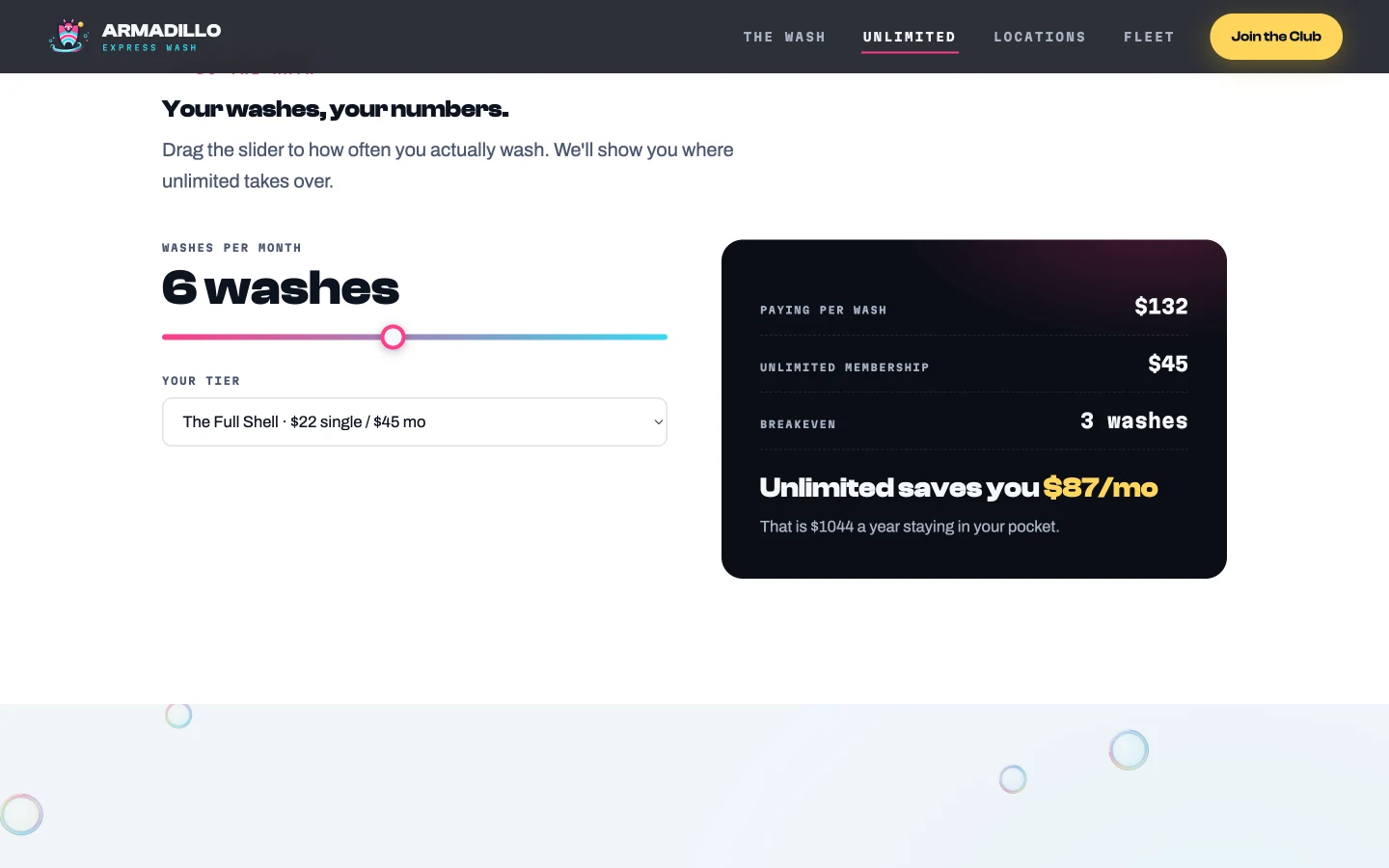
Membership pitches fail when they ask for belief. Math doesn't need any. The membership page carries a two-input calculator, how often you wash, which tier, that renders the comparison live in a dark telemetry card: what pay-per-wash costs at your cadence, what unlimited costs, where the breakeven sits, and what stays in your pocket over a year. Drag the slider to six washes on the flagship tier and the verdict reads $87 a month saved, $1,044 a year. The visitor closes themselves, no email demanded, no lead form guarding arithmetic.
Beside it, a second tool answers the question every non-member actually arrives with: what's on my car? Pollen film, bug splatter, brake dust, bird droppings, mud. Pick your problem and the site calls the tier and argues for it in two sentences of Texas-specific reasoning. It teaches the tier ladder without a comparison table, and it's the kind of surface a template can't fake because it requires knowing why bug protein etches clear coat in July.
The Ninety-Second Signup
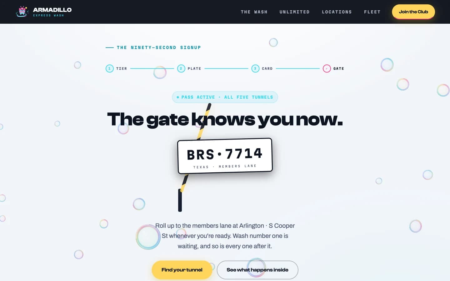
The industry's defining absence is the button that says "coming soon" where the membership signup should be. So this brief doesn't argue for online signup, it ships the flow, working, clickable, timed. Four steps on one page: pick a tier, type a plate, enter a card, watch the gate arm lift. The plate renders live as you type it, the tier you tapped on the pricing page arrives preselected, and the confirmation names your home tunnel. It takes about ninety seconds, which is the point, and the demo says so out loud when you finish.
The candor has a surface too. A working member portal mockup answers the vertical's worst reputation problem, the cancellation dark pattern, by making the exit literally countable: tap "Cancel my pass," tap "Yes, cancel it," done, washed through the end of the month, reactivation free. The FAQ links to it with the line "count the taps yourself." Trust claims are cheap; a cancel button you can operate is not.
The Site Checks the Sky
Wash demand is weather. Rain kills a Tuesday; the first clear day after a front is Christmas; pollen season prints money. So the site watches the sky: every location card carries live conditions pulled from a no-key weather API, real temperature, a wash-day verdict, and the rain answer built into the message, "Rain day. Members re-wash free within 48 hours." Open or closed is computed from the actual clock, not asserted in copy that goes stale.
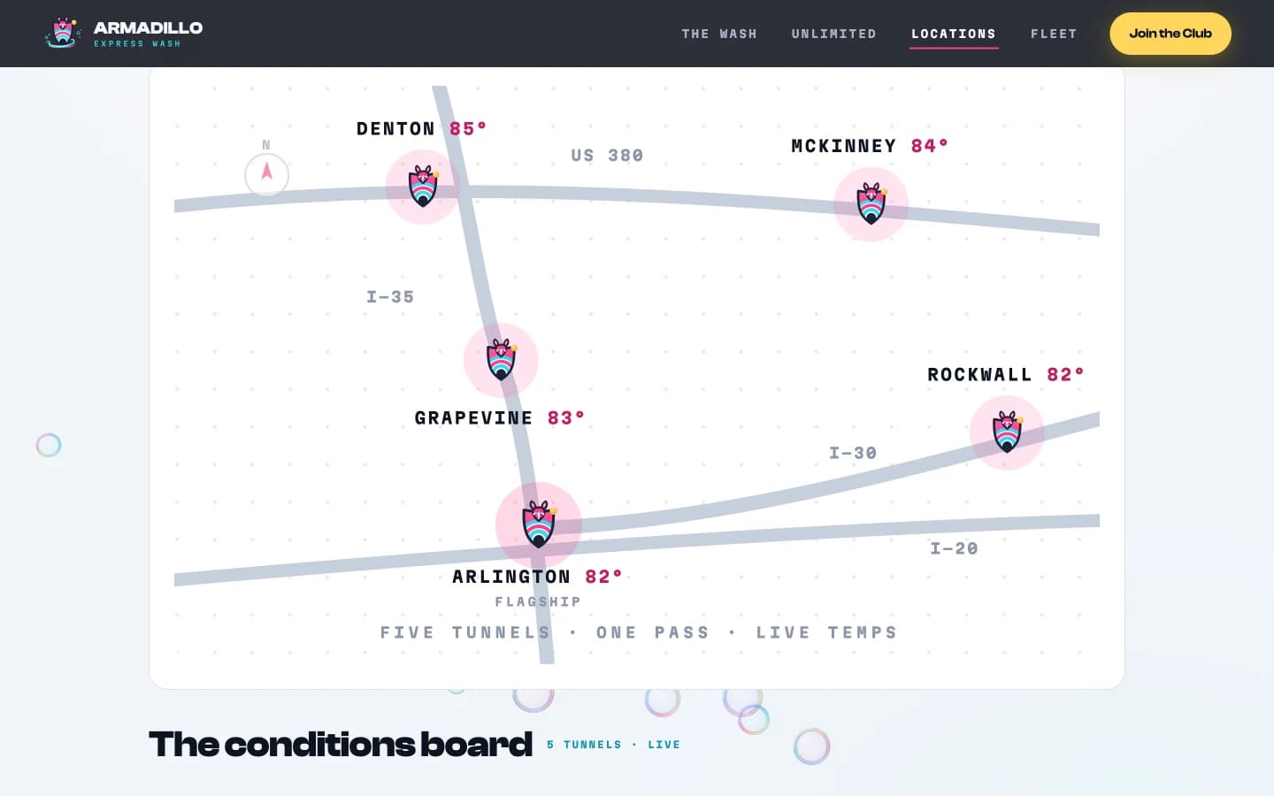
This is a small amount of engineering and an enormous amount of positioning. A returning visitor sees a site that is alive on their block today, and the rain-guarantee message converts the industry's biggest objection, "why pay monthly when it rains?", at exactly the moment the objection forms. Above the board sits a stylized chain map of North Texas, five shell-marked pins on their highways, each carrying its lot's live temperature. And the site remembers you: pick a home tunnel once, on the locations page or during signup, and the homepage leads with your lot's conditions under a My Tunnel badge from then on. The demonstration site runs all of this live; a production build extends it with wait states from the point-of-sale system's plate counts.
Every Lot Gets a Real Page
Multi-location wash chains habitually ship one locations page with a list of addresses, then wonder why individual lots don't rank. Each location is its own local-search opportunity with its own Google Business Profile, and a profile is only as strong as the page behind it.
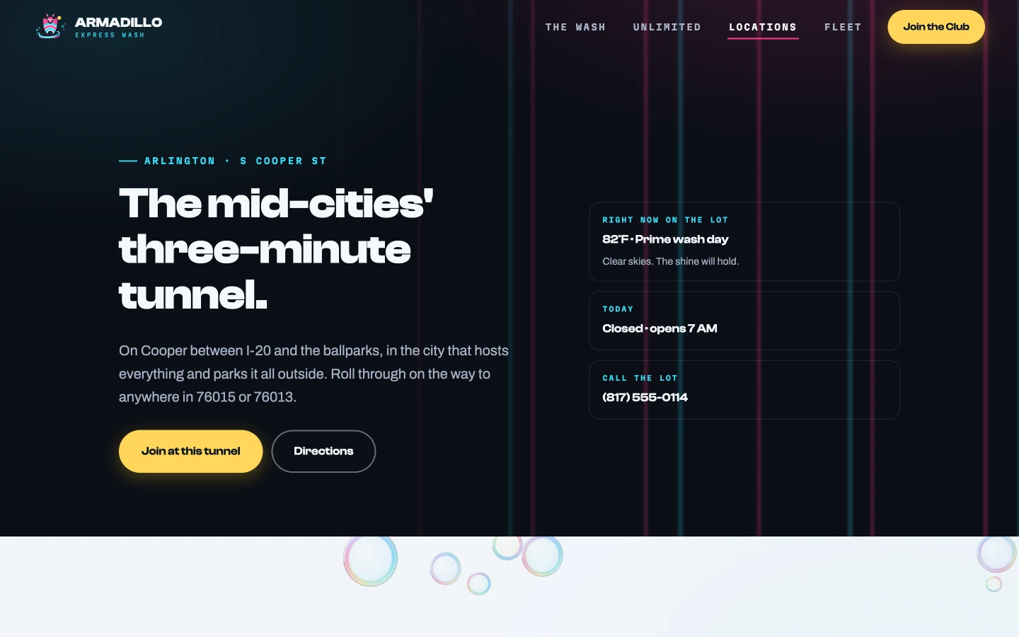
The brief's pattern page is Arlington. It opens in the location's own vocabulary, the mid-cities, Cooper Street's game-day crawl, the ballparks five miles north, carries the lot's own phone number in its own area code, a stylized SVG corridor map instead of a rented map embed, live conditions in the hero, an hours table, the vacuum count, and neighborhood reviews. Under the hood sits CarWash structured data with geo coordinates, hours, and amenities, the machine-readable version of everything above. Repeat the pattern across the chain and it stops competing as one generic website and starts competing as a roster of local businesses that share a pass.
Your Plate Is the Pass
The membership's physical magic deserves its own surface: there is no card, no sticker, no app at the gate. The plate reader sees you and the arm lifts. The membership page renders this as a scanning Texas plate, three numbered steps, and the honest edge cases handled in plain sight, paper plates and motorcycles get an RFID tag, five plates share a family account, cancellation is two taps with no retention theater.
That candor is strategy. This industry's reputation problem is the cancellation dark pattern, chains that make joining instant and leaving a phone tree. Every trust surface on this site, cancel anytime in the FAQ's first answer, the re-wash rule, prices in daylight, is conversion engineering aimed at the skeptic who has been burned by a wash club before. And one line runs through the whole site as its spine: Every location. Every wash. One pass. No asterisks.
The Rest of the Machine
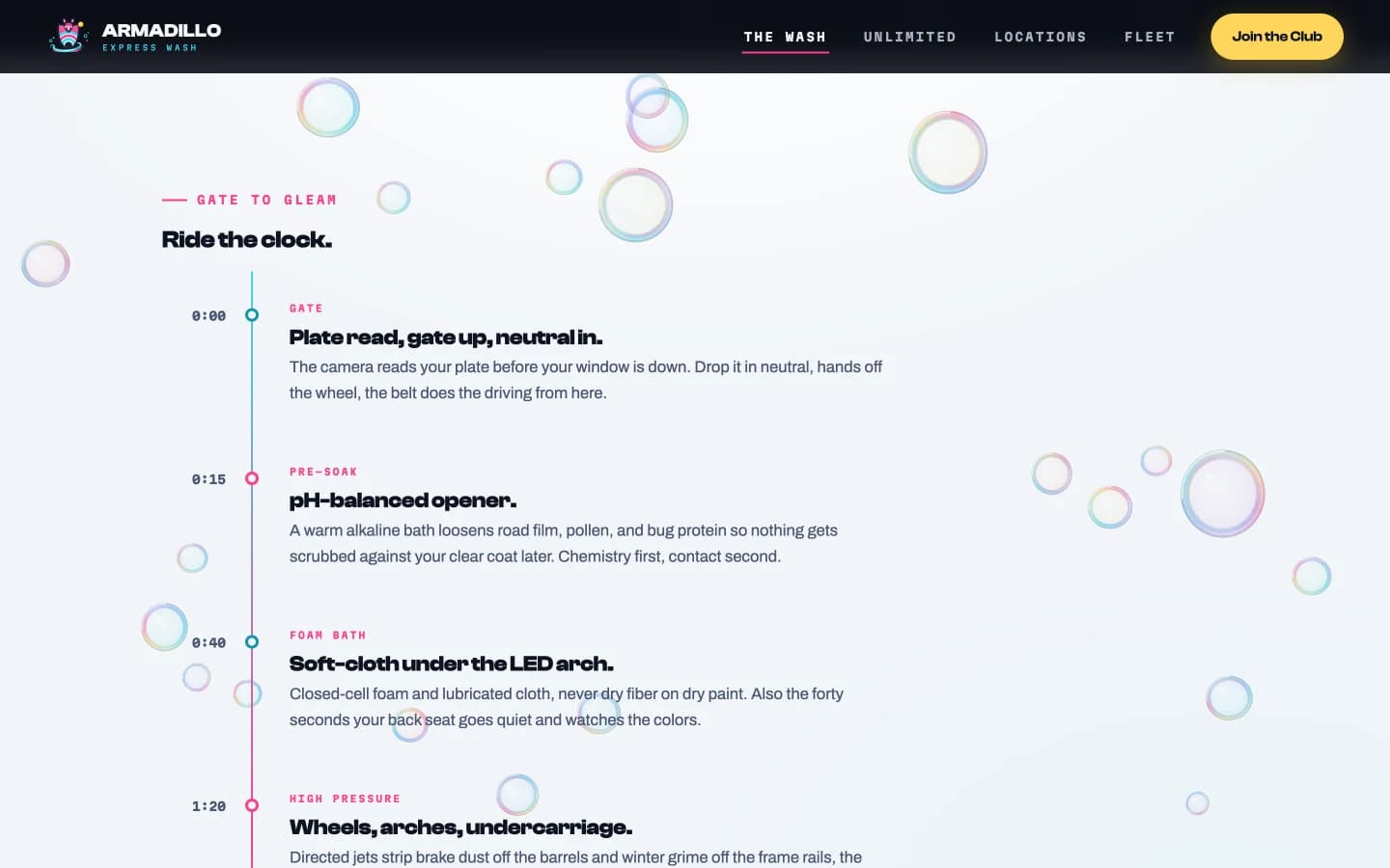
The Wash page walks the tunnel in second-marks, 0:00 gate, 0:15 pre-soak, 2:40 heated dry, a timeline that earns its numbers because the product genuinely is a 180-second sequence, then states the chemistry as promises: lubricated contact only, reverse-osmosis final rinse, and a Never column, no wheel acid, no silicone sling. The fleet page pitches the operator's other revenue line in a dispatcher's language, plates in, gates up, one invoice, with an inquiry form that qualifies fleet size before a human ever answers it. Gift cards ride the membership page as a single confident band.
Everything ships as an accessibility-floor build: keyboard focus visible throughout, reduced motion respected end to end, real text everywhere the canvas performs, and the whole surface verified in both Chromium and WebKit from phone to ultrawide.
Why This Wins the Room
The demonstration brand is fictional, but every operating constraint is real: a multi-lot footprint, four tiers topping out in graphene, plate-reader entry, free vacuums, weather-dependent demand. Any operator reading this sees a site that publishes prices most wash sites hide, signs up members most wash sites can't, gives each lot the local page it never had, and checks the weather their revenue already depends on. The tunnel gets the meeting. The math machine, the live board, and the location-page pattern are what the meeting is about.
Build It For Real
Want this architecture, executed for your practice?
I build the version of this that ships. Designed end to end, launched on production grade infrastructure, with the surfaces above tuned to your actual book of business.