The Architecture of a Modern Family Dental Practice
How a West Plano family decides between three dentist sites in the eight minutes between a chipped tooth and a phone call. Ten surfaces, each tuned for the way a high-intent patient actually books a chair.
Services Sold By Outcome, Not by Procedure Code
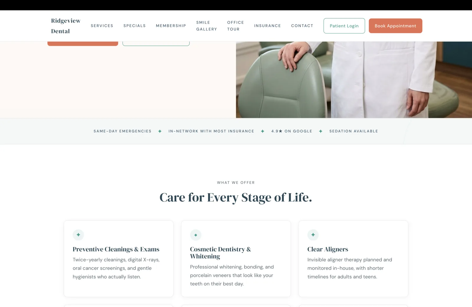
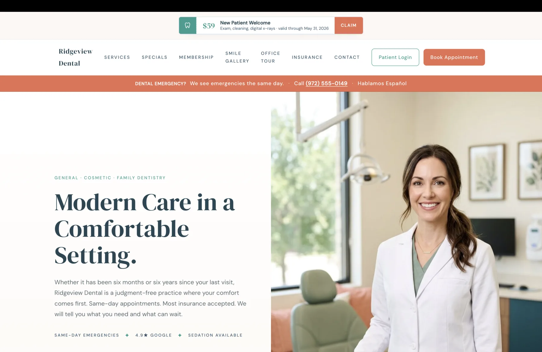
The first surface inside the page is not "Our Services," it is a four-signal trust band followed by an outcome-named services grid. The trust band runs once, on the brand's calm sage tone, and tells the patient in five seconds the four things they came to verify: same-day emergencies, in-network insurance, a 4.9 star reputation, and sedation for the patient who needs it. None of those four items is a service. Each is a confidence signal that earns the right to keep scrolling.
The services grid that follows refuses to use procedure-code language. "Preventive Cleanings and Exams" is paired with the descriptor "gentle hygienists who actually listen," which is the actual outcome a patient is buying. "Cosmetic Dentistry and Whitening" closes its descriptor with "your teeth on their best day," because nobody booking a cosmetic appointment is shopping veneer brands. "Clear Aligners" pairs with "shorter timelines for adults and teens," because a working adult choosing aligners over braces is making a calendar decision, not a treatment one.
The eyebrow above the headline reads "What We Offer," and the headline itself reads "Care for Every Stage of Life." That phrasing is the structural commitment. The site is not a cosmetic-dentist site, an emergency site, or a pediatric site. It is a family practice that says so on the second screen, and that single editorial choice keeps the site from turning into the four separate landing pages most dental sites end up shipping when they cannot decide who they are for.
Three Dated Offers, Run Year-Round
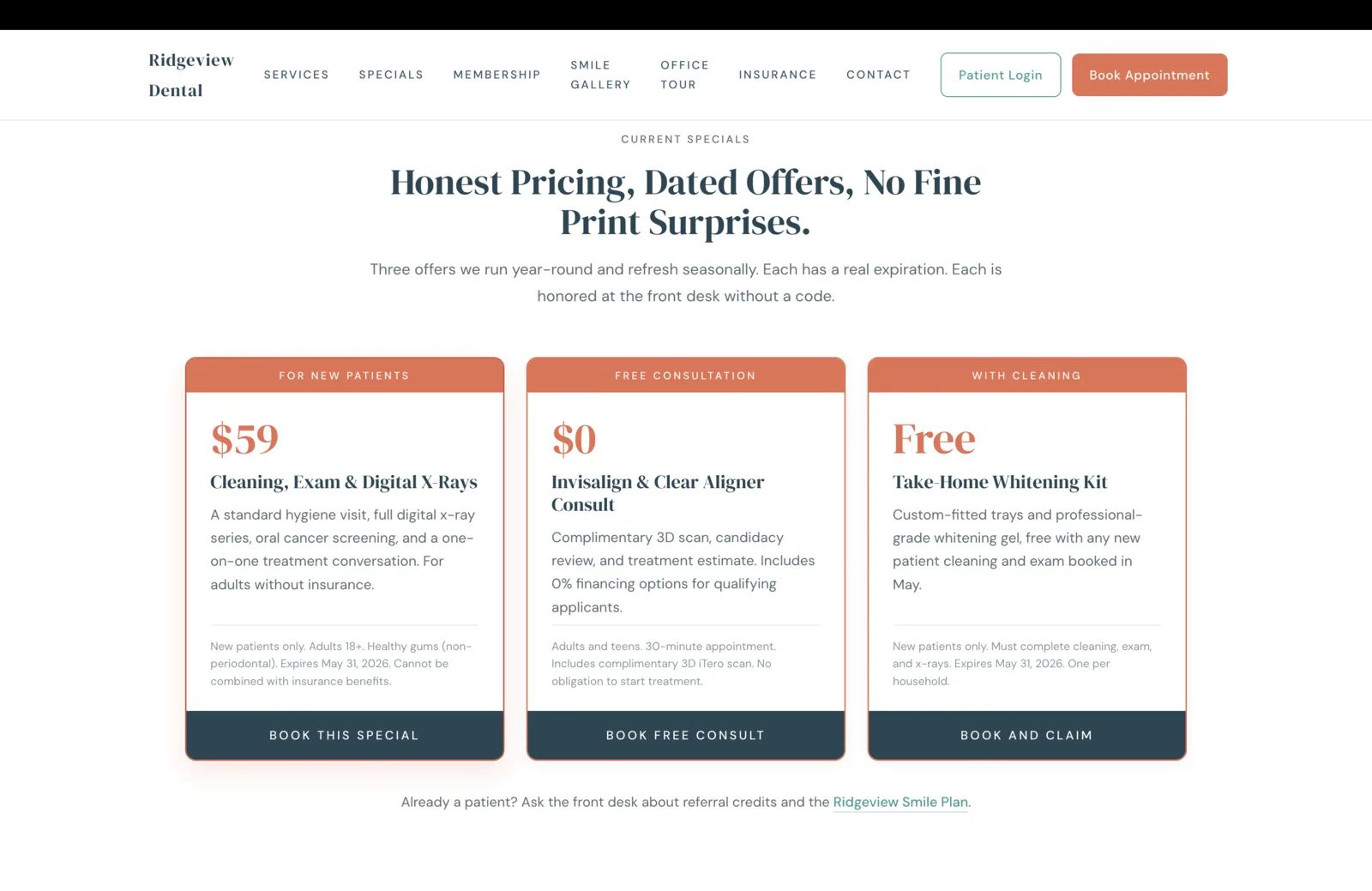
Most dental sites shape specials as a single hero pill that says "New Patient Special." The pill is undated, unscoped, and almost never actually honored at the desk because the front-of-house team has a slightly different version of it. The result is a special that earns no trust and converts at a fraction of what it could.
Ridgeview gets this surface right by treating Specials as its own destination, not a banner. Three offers, dated, scoped, honored at the desk without a code. The cleaning, exam, and x-ray bundle at fifty-nine dollars is the new-patient anchor. The Invisalign consult at zero dollars is the cosmetic doorway. The take-home whitening kit, free with a new-patient cleaning and exam, is the upsell that pairs the new-patient appointment with a future cosmetic conversation. Every card carries the eligibility line in the same calm gray as the rest of the section, because hiding fine print costs more trust than disclosing it does.
The headline on the section is the architecture of the entire practice in one line: "Honest Pricing, Dated Offers, No Fine Print Surprises." The subhead earns it. "Each has a real expiration. Each is honored at the front desk without a code." A patient who has been burned by a "free consultation" offer that turned into a six-hundred-dollar diagnostic at a competing practice reads those two sentences and understands that this office is signaling a different operating standard.
A Smile Plan, Not a "Quote on Request"
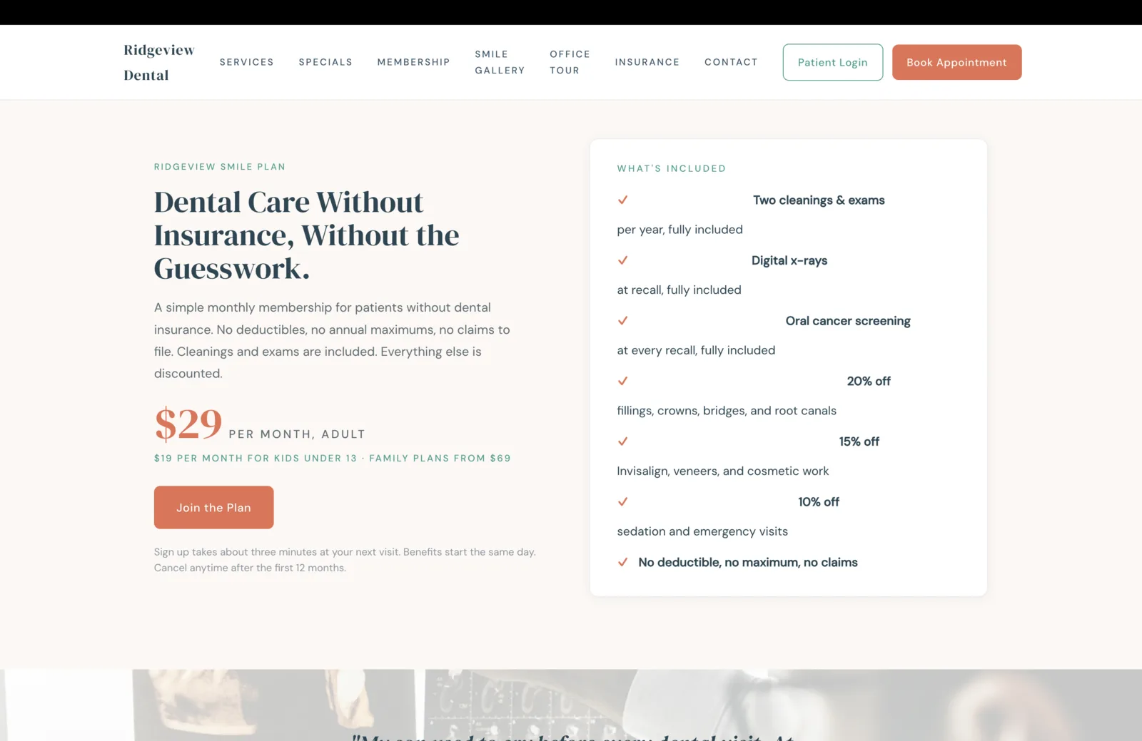
A dental membership is the highest-margin recurring line on a cash-pay patient. It is also the surface most dental sites refuse to publish, because admitting that the office runs an in-house plan implies the office has thought about the uninsured patient enough to build one. Most have not. The patient asks at the front desk and gets a quoted number that varies by who they ask, which is the wrong answer to the right question.
Ridgeview publishes the plan in full. Twenty-nine dollars a month for adults, nineteen for kids under thirteen, family plans from sixty-nine. Two cleanings and exams included. Digital x-rays at recall included. Oral cancer screening at every recall included. Discounts on the rest of the work named in percentages, not in vague "savings." The closing benefits line, "no deductible, no maximum, no claims," is the line that does the heaviest lift on the section, because every word of it names a specific frustration the uninsured patient has had with traditional dental insurance.
The microcopy under the join button is the operational commitment that earns the plan. "Sign up takes about three minutes at your next visit. Benefits start the same day. Cancel anytime after the first twelve months." Three sentences. No salesperson. No call. No claim. The patient who has spent four hours on hold with a dental PPO this year reads that paragraph and understands the trade they are being offered, and the trade is honest.
A First Visit Walked Through, Step By Step
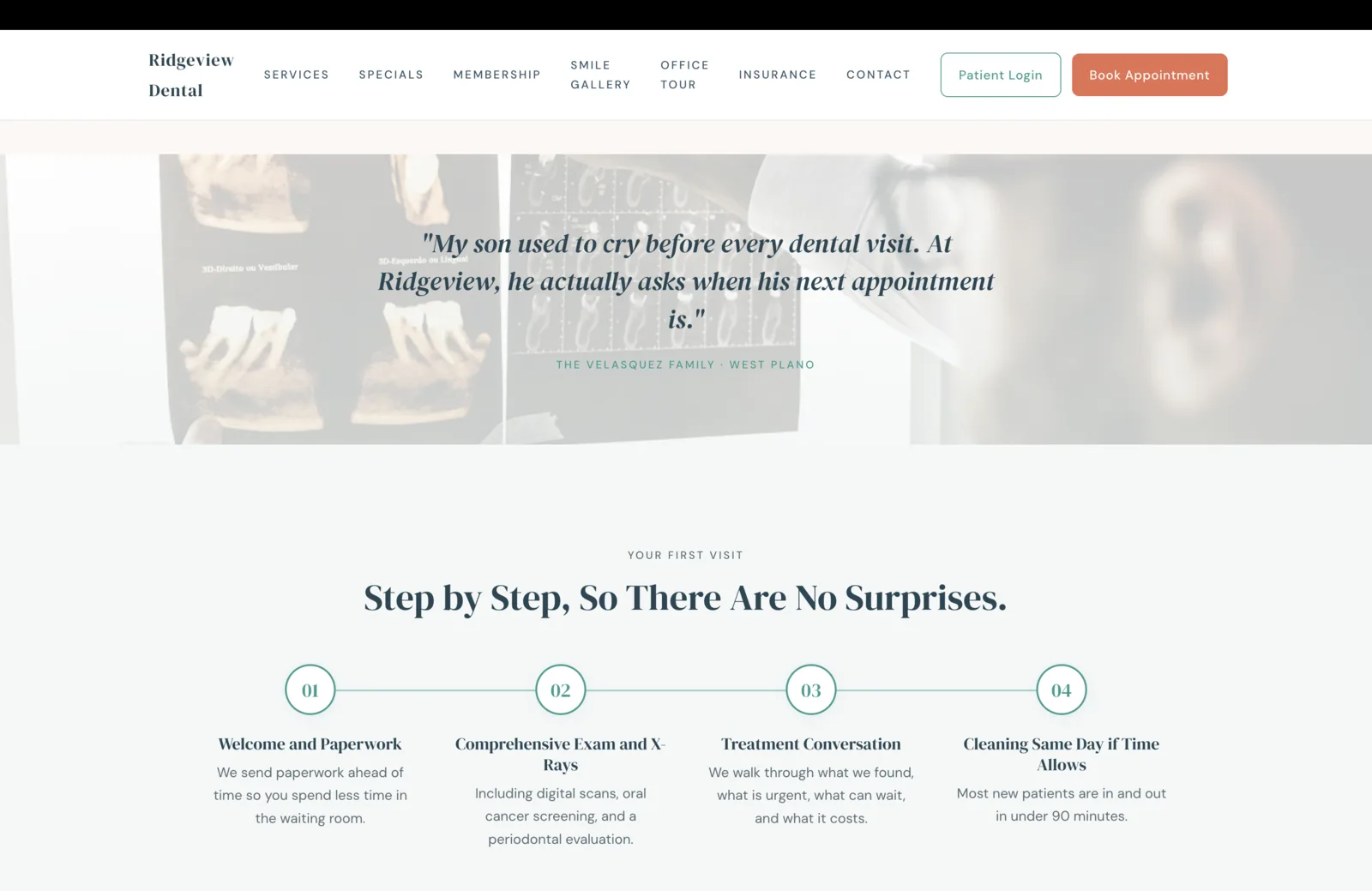
Dental anxiety is the single biggest conversion blocker in the category. The patient is not avoiding the dentist because of the price, the location, or the insurance. They are avoiding the chair because they do not know what is going to happen in the chair. So the highest-converting move on a dental site is not a prettier hero photo, it is a step-by-step walkthrough of the first visit. The unknown is what the patient is afraid of. The page can fix that.
The four steps are deliberately calm. Welcome and paperwork, sent ahead so the waiting room is short. Comprehensive exam and x-rays, with the screening modalities named so the patient knows what to expect on the chair. Treatment conversation, framed as a conversation, with the line "what is urgent, what can wait, and what it costs," which is the line a patient who has been upsold at another office reads as relief. Cleaning the same day if time allows, with the operational commitment that most first visits land under ninety minutes total. None of the four steps overpromise. All four reduce the unknown.
The pull-quote that floats above the process is the right testimonial for this surface. "My son used to cry before every dental visit. At Ridgeview, he actually asks when his next appointment is." That sentence does what no benefits list can: it shows a patient who entered with the highest version of dental anxiety and exited with the highest version of trust. The quote sits over a faded x-ray photograph rather than a glossy operatory shot, because the surface is about the work, not the room. A parent reading this section already feels the chair tightening their shoulders. The quote loosens them before the four steps explain why.
A Named Doctor, Not "Our Team"
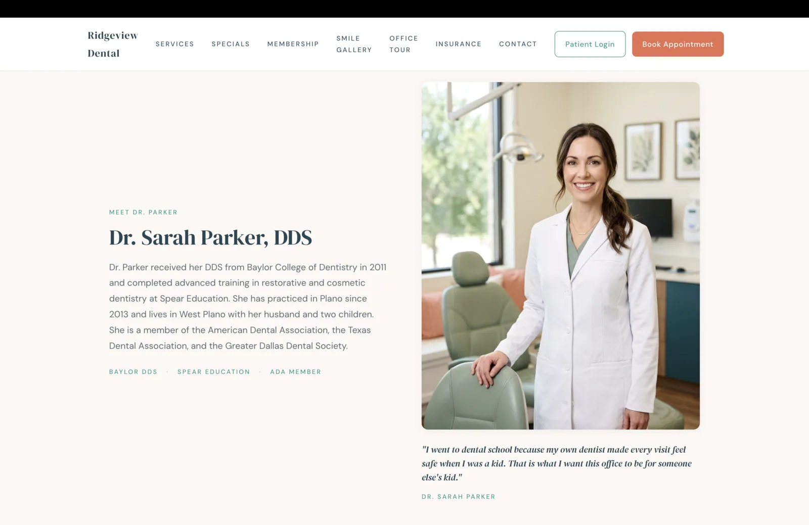
A patient choosing a dentist at this tier is choosing a doctor, not a brand. The site has to admit who that doctor is, and the admission has to feel like a person, not a press release. So the section opens with "Meet Dr. Parker," not "Our Team." The portrait is in the same operatory as the hero, which signals continuity rather than the stock-photo doctor a less serious practice would use. The bio is concrete: dental school named, year of graduation, advanced training program named, year she started practicing in Plano, family, three professional memberships. Each of those data points is verifiable, which is the actual point of a doctor bio.
The three credentials beneath the bio do quiet work. Baylor DDS reads as Texas-grown, a regional credential a Plano family understands. Spear Education is the cosmetic-and-restorative continuing-education credential the rest of the high-end Texas market knows by name. ADA Member is the floor that says the doctor is in good standing with the profession. None of the three is filler. All three earn their pixels.
The signed quote underneath is the relational move. "I went to dental school because my own dentist made every visit feel safe when I was a kid. That is what I want this office to be for someone else's kid." That sentence is what makes a parent in West Plano book this office over the four other family practices within five miles. It is also a sentence that cannot be ghostwritten by a marketing agency, because it names a specific origin story and a specific commitment, and the patient on the other side of the screen can tell.
Stories From the Chair, Not Star Aggregates
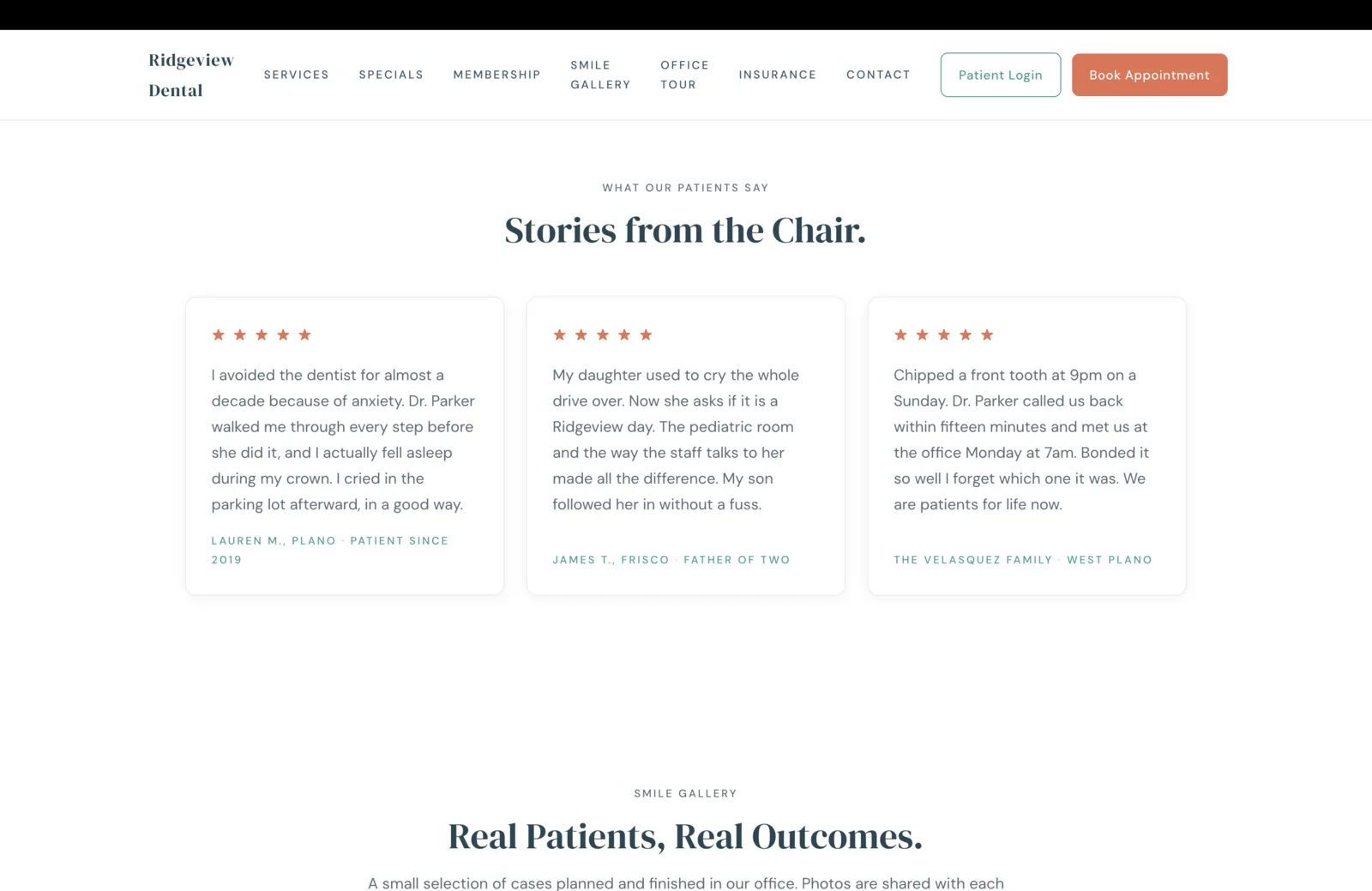
The default testimonials surface on a dental site is a strip of star aggregates from Google, Yelp, and Healthgrades, sometimes with a "4.9 average from two hundred reviews" pill underneath. That treatment converts at almost zero, because the patient on the other side of the screen has already seen those numbers on the search results page. They are looking for the story underneath the rating.
So this section gives them three stories, each substantive enough to read in full. Lauren M. describes a decade of avoidance ending in falling asleep during a crown, which is a sentence that names the exact emotional arc dental anxiety actually follows. James T. describes the pediatric room and the staff voice through the lens of his daughter and son, which converts the parent reading it because the parent is choosing for the kid. The Velasquez Family describes a Sunday-night chipped tooth, a fifteen-minute callback, and a Monday morning seven-am appointment, which is the emergency promise from the homepage strip rendered as a real story with real names and a real day of the week.
The three quotes are deliberately diverse. Anxiety, family, emergency. Those are the three biggest decision drivers in the dental category, and the section runs them in a single row so a patient with any of those three concerns sees their own situation reflected back at them within five seconds of arriving on the surface. The five small coral stars at the top of each card are a quiet visual handshake with the platform reviews the patient just left, but the volume of the section is the prose, not the rating.
Technology Paired With Comfort, In One Section
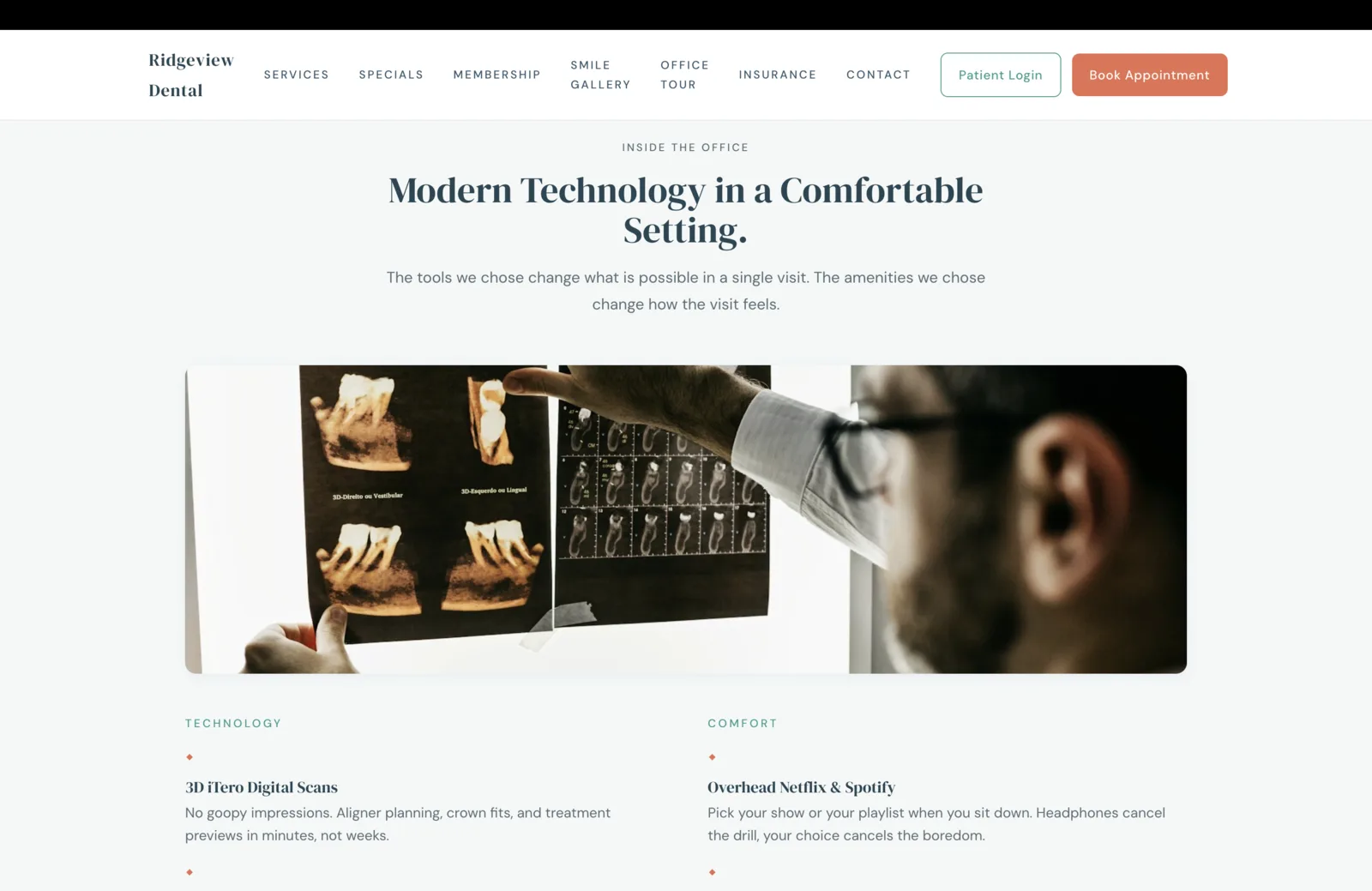
Most dental sites silo technology and comfort onto separate pages. Technology gets a "Our Technology" page that lists CEREC, iTero, intraoral cameras, and low-dose x-ray as if the patient is a procurement officer. Comfort gets a "Patient Comfort" page that mentions Netflix and warming blankets as if comfort is a perk. The patient buys both at once, so the page should sell both at once.
This section pairs them in a single column structure. Technology on the left, Comfort on the right, both rendered in the same typographic register, both opened by a small coral diamond glyph in the brand color. 3D iTero scans pair with overhead Netflix and Spotify. CEREC same-day crowns pair with heated massage chairs. Intraoral cameras pair with weighted blankets and pillows. Low-dose digital x-ray pairs with the pediatric room. The sedation suite pairs with sterilization the patient can see. Five rows down, each pairing makes the case for both halves of the dental experience: the work, and the room the work happens in.
The editorial photograph above the columns is the right visual anchor for the section. A dentist in glasses pointing at a 3D dental scan, taped to a window, the scan in Portuguese as if borrowed from a teaching hospital. The image looks like the work, not like a dental practice's marketing team's idea of the work. That single shot does more for the section's credibility than a glossy operatory photograph would, because it shows the kind of careful, slow examination the rest of the page promises.
Financing Without the Sales Pitch
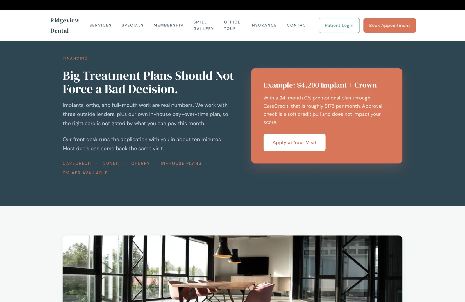
A four-thousand-dollar implant decision is the moment a dental patient walks away from a practice they otherwise liked. Not because they cannot afford the work over time, but because the practice could not name how the work could be paid for over time without a sales pitch. So the financing surface is the section that earns the patient back, and the way it earns them back is by being concrete and short.
Three outside lenders are named, plus in-house plans. CareCredit, Sunbit, Cherry. Each is a real name a patient may have already used at another medical practice. The in-house plan sits beside them, framed as parity rather than backup, because for a patient who would rather not run a third soft credit pull this year, the in-house option is the right answer. The "0 percent APR Available" tag is the loudest line in the row, because zero-percent financing is what turns a four-thousand-dollar implant into a one-hundred-and-seventy-five-dollar-a-month sentence the patient can finish.
The example card on the right does the heavy conversion work. "Example: $4,200 Implant and Crown. With a 24-month 0% promotional plan through CareCredit, that is roughly $175 per month. Approval check is a soft credit pull and does not impact your score." Four sentences. A real procedure. A real loan term. A real monthly number. A real pull type. The patient who arrived at the page convinced they could not afford the work walks away with a sentence they can repeat to their spouse over dinner. That is what financing copy is supposed to do.
An Honest Insurance List, Not "We Accept Most Plans"
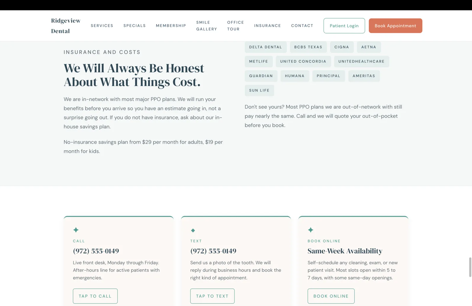
"We accept most insurance" is the default insurance line on a dental site, and it loses about a third of the bookings it should win. The patient is searching for a dentist who takes their plan, by name. If the plan is not on the page, the patient assumes it is not accepted and moves on. The fix is the most boring lift on the entire site: name every carrier as a pill, in a calm grid, and let the patient scan.
Twelve carriers are named. Delta Dental, BCBS Texas, Cigna, Aetna, MetLife, United Concordia, UnitedHealthcare, Guardian, Humana, Principal, Ameritas, Sun Life. Each is a small pale pill in the brand mint, set on a soft cream field, separated by enough whitespace that the eye reads them as a list rather than a logo wall. The headline above earns the surface: "We Will Always Be Honest About What Things Cost." The honest disclosure beneath the pills is what closes the patient who does not see their plan in the grid: "Most PPO plans we are out-of-network with still pay nearly the same. Call and we will quote your out-of-pocket before you book." That sentence converts because it admits a structural truth the rest of the dental industry hides.
The contact row beneath is the operational tail of the same surface. Three cards. Call, Text, Book Online. Each with a real action, not a marketing promise. The Text card is the one that quietly does the most work, because a patient with a chipped front tooth would rather send a photo than call. The Book Online card carries the operational reality, "most slots open within five to seven days, with some same-day openings," which is the kind of honesty that converts the patient who has been ghosted by three other practices this month.
A Footer That Earns the License
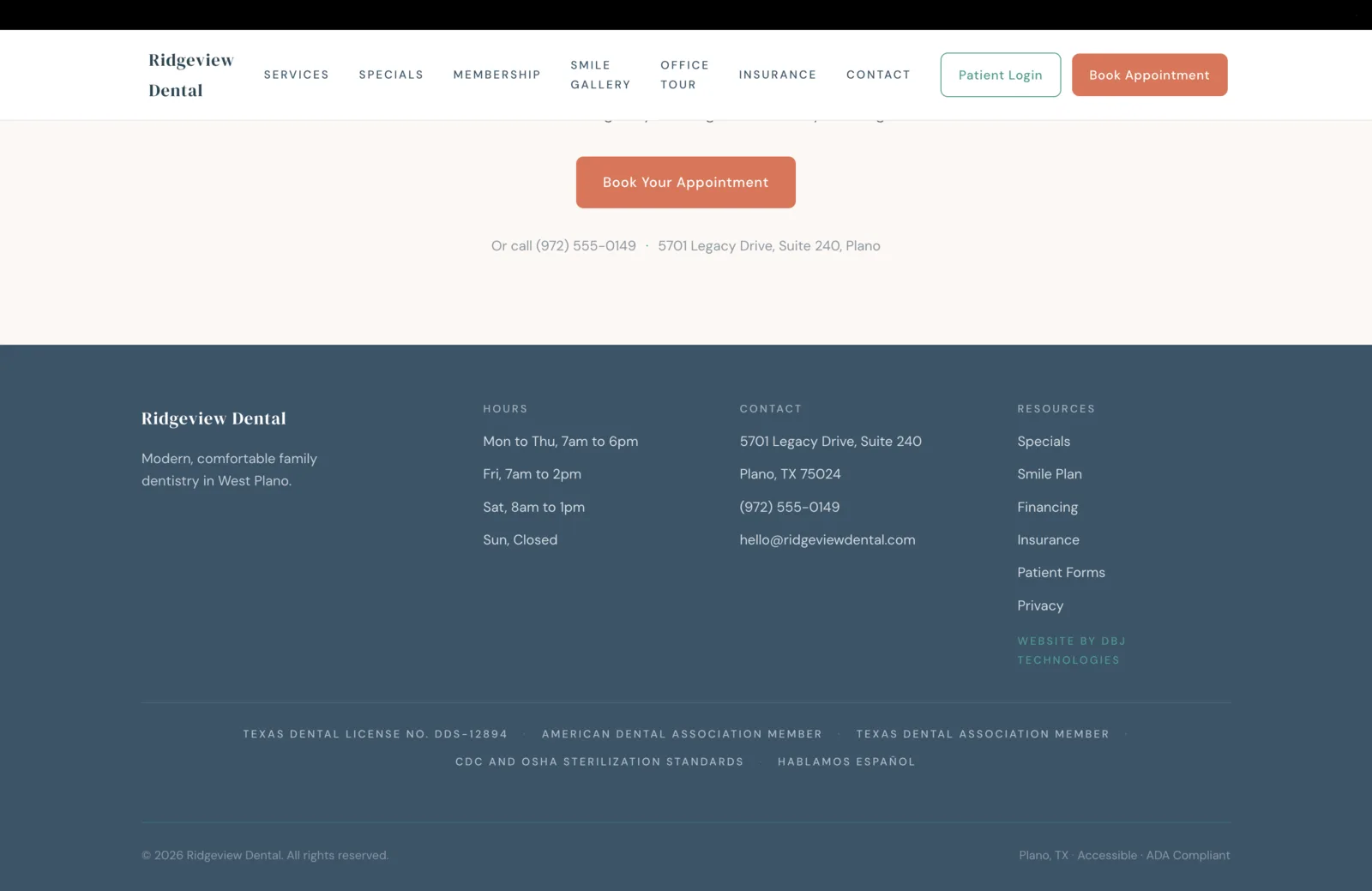
The footer is the regulator's surface and the patient's last reassurance. A patient who scrolls past it will not read every line, but the Texas State Board of Dental Examiners, the ADA, and the careful patient who knows what to look for will find every required item exactly where it belongs.
Four columns on a calm navy field. The wordmark and a one-line description on the left, hours in the second column, contact in the third, a small resources index on the right with the studio email at the practice domain and the "Website by DBJ Technologies" credit closing it quietly. Saturday hours are stated explicitly because a working West Plano family books cleanings on Saturday morning, and an office that does not say so loses those bookings before the page loads. Sunday is stated as closed rather than omitted, because absence is the wrong signal for a healthcare practice.
The compliance line that runs across the bottom is the surface most dental sites refuse to spend the pixels on. Texas Dental License No. DDS-12894, stated. American Dental Association membership, stated. Texas Dental Association membership, stated. CDC and OSHA sterilization standards, stated. Hablamos Español, stated as a compliance signal rather than a marketing pill. ADA Compliant and Accessible, stated as the digital-accessibility commitment a 2026 dental site is supposed to make. Nothing is hidden behind a "Legal" link. Everything a Texas dental practice is supposed to display is exactly where a patient or a regulator expects to find it, set in a calm pale gray that reads as professionalism rather than fine print.
Build It For Real
Want this architecture, executed for your practice?
I build the version of this that ships. Designed end to end, launched on production grade infrastructure, with the surfaces above tuned to your actual book of business.