Earning the Private Call
A Park Cities buyer at the four-million-dollar level has already seen every public listing on Zillow and Redfin. She is not searching MLS. She is vetting the agent. This brief proposes the eight surfaces a luxury residential practice needs to earn the private call.
A Practice, Not a Brokerage Template

A buyer at the four-million-dollar mark has already seen the public listings on Zillow, Redfin, and the brokerage syndication. They are not searching MLS. They are vetting the agent. So the first surface inside the site is a face and a voice, not an inventory grid.
The portrait is intentional. A calm interior, a chandelier in the background, the agent in a posture that reads as composed rather than performed. The text underneath is first-person, signed, and concrete: eighteen years, two hundred transactions, "intentionally small," every introduction handled personally. The license number sits at the foot in the brand color. There is no team page. The buyer reading this is hiring one person, and the site says exactly who.
This is the line everything else is built on. The listings, the closings, the press, the private list, the contact path: every surface that follows exists to support the claim made on this single panel. Real estate at this level is not about houses. It is about reading a room before anyone speaks.
Currently Representing
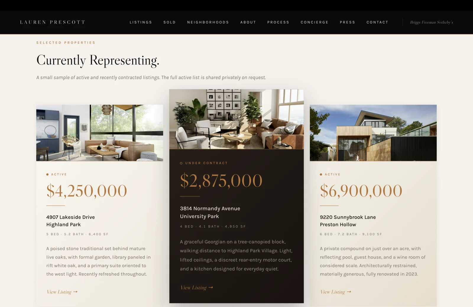
Three cards. Two Active, one Under Contract on an inverted dark field so the eye reads the pace of the practice in two seconds. Real addresses. Real prices, set in the same serif as the headline so the number is the loudest thing on the card. Beds, baths, square footage. A short editorial description that sounds like a knowledgeable friend describing the property over coffee, not a listing remark.
I built this surface to read like a working ledger, not a search interface. A buyer at this price point already has the public stream. What they want to see here is whether this practice is moving inventory right now, in the neighborhoods they care about, at the price points they are at. The status glyphs (a colored dot for Active, an Under Contract treatment that flips visual weight onto a dark field) deliver that read in the first scan. Prices are visible without a click. There is no "Search MLS" button anywhere in sight.
The supporting line at the top is honest, and it is what makes the surface work: "A small sample of active and recently contracted listings. The full active list is shared privately on request." That sentence signals the public listings are the doorway, not the inventory, and that the real conversation begins on the call.
A Public Ledger of Recent Closings
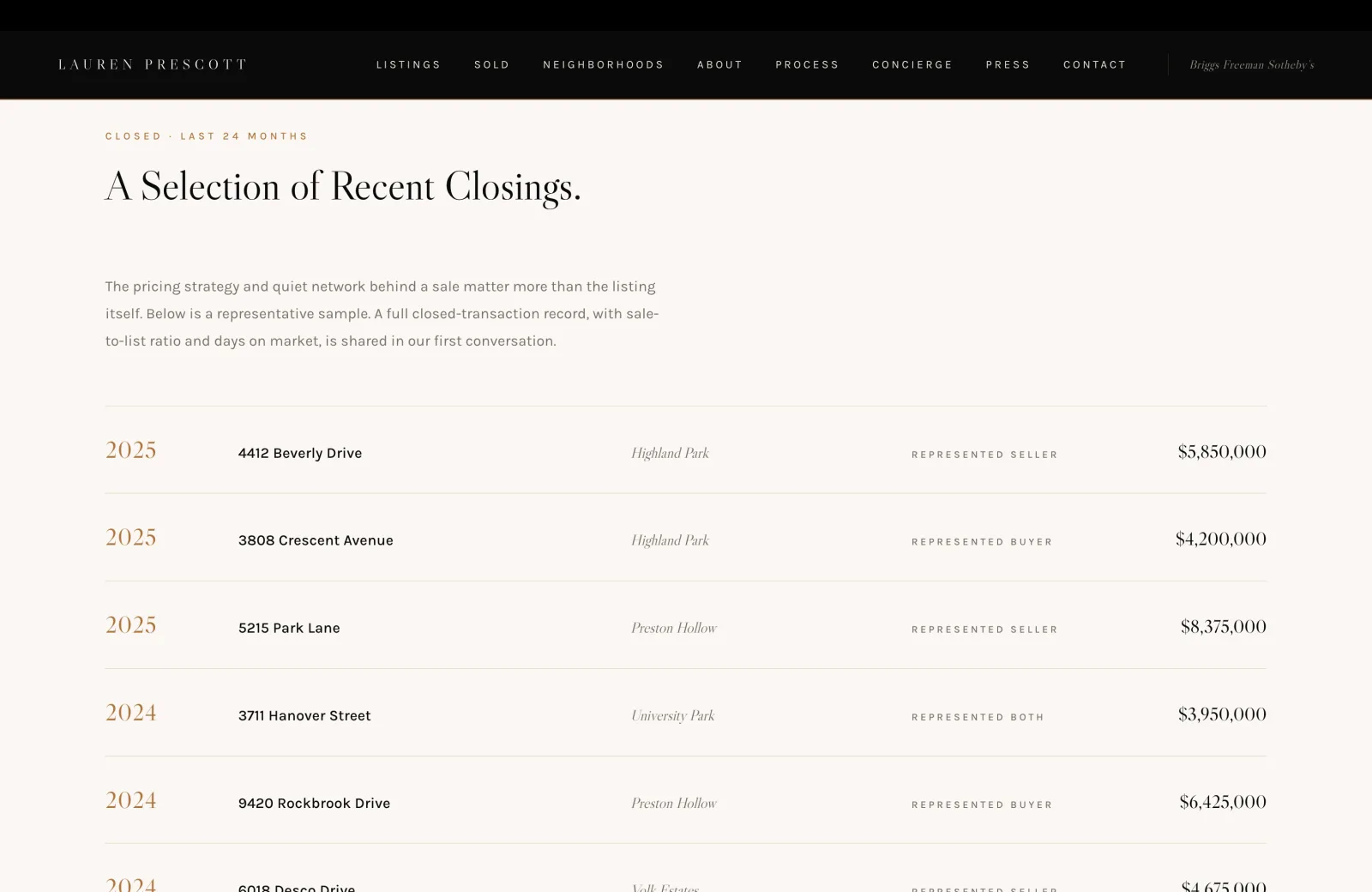
Anyone can claim a career-volume number. A line that reads "$340M Career Volume" at the bottom of the hero tells a buyer almost nothing on its own. The closings table is what tells them everything.
A year-stamped record, twenty-four months deep, with the address, the neighborhood, the side represented (Represented Seller, Represented Buyer, Represented Both), and the closed price. Each row is set in proportions that read as an editorial table rather than a spreadsheet, with the year in the brand color on the left and the price right-aligned in formal serif. A buyer can scan a quarter of the page and know whether this practice is doing the kind of work they need, in the neighborhoods they care about, at the price points they are at.
The supporting line is the right one: "The pricing strategy and quiet network behind a sale matter more than the listing itself." Sale-to-list ratio and days on market are reserved for "shared in our first conversation," which is the right place for them. Anything more granular than that is a private conversation, not a public surface.
Trust Signals With Real Backing

After three sections of cream and listings, the eye needs a stop. The testimonials sit on a black field, set in serif italics, with quiet attribution underneath. There are no five-star icons. No review platform badges. No "Trusted by 200+ families." The page slows down, and the buyer reads.
The quotes themselves are what convert. "Lauren negotiated a sale price two hundred thousand dollars above what three other agents told us was realistic. She read the market correctly and stayed patient with us when our nerves did not." That is a sentence a buyer can verify against the closings table on the previous section. It is also a sentence that names a specific skill (reading the market correctly under pressure) instead of an abstract one (great communication).
The quiet move here is what is missing. No headshots of the testifiers. No video. No interactive carousel. I made the architecture calm because the buyer at this price point reads calm as confidence. Effusive design reads as desperation. A black field, serif italics, and three substantial quotes in a row is what a practice running at the top of the market looks like in this section.
Dated Industry Recognition

Press placements without a year are noise. A 2017 mention in D Magazine reads exactly the same as a 2025 one if the dates are not visible, and the buyer who has been pitched by every Compass agent in town has learned to discount undated claims entirely. So every press mark is dated, and every honor is dated.
The mastheads are set in their actual publication treatment so each one earns its row. D Magazine in italic serif, Wall Street Journal in uppercase letterspaced sans, Mansion Global in formal serif, PaperCity in spaced caps, Architectural Digest in italic, Robb Report on a calm second row. The visual hierarchy reads as recognition rather than logo collage.
The honest line above the wall is what the section is actually about: "Most of what I do never appears in print. The work below is what clients and editors chose to share." A buyer reads that as confidence rather than modesty. The recent honors block underneath, both 2025, year-stamped in the brand color, is the proof.
The Private List

I treat this as the most valuable form on the entire site. Luxury residential inventory turns mostly off-market, and the buyer who hands over their email here is signaling interest before they are ready to call. The agent who captures that email controls the next twelve months of that buyer's purchase journey.
So the section is given the gravity it deserves. Black field. Gold hairlines top and bottom to set it apart from the cream sections above and below. A single field, a single button, no other CTAs competing for attention. The headline is "Off-Market Inventory, Sent Quietly." The supporting copy is short and shaped by a buyer who has been spammed by every brokerage CRM in DFW: three or four times a year, pre-market homes, off-market inventory clients are willing to entertain, the occasional note. No newsletter, no listings firehose, no algorithm.
The microcopy below the button is the actual reason the form converts. "Vetted personally. Your address is never shared, sold, or syndicated." Three commitments, set in italic, calm. The buyer reads that line and understands that this list is not the marketing pipeline they were trying to escape when they left Zillow. It is access to the part of the market they cannot see anywhere else.
A Quiet Conversation
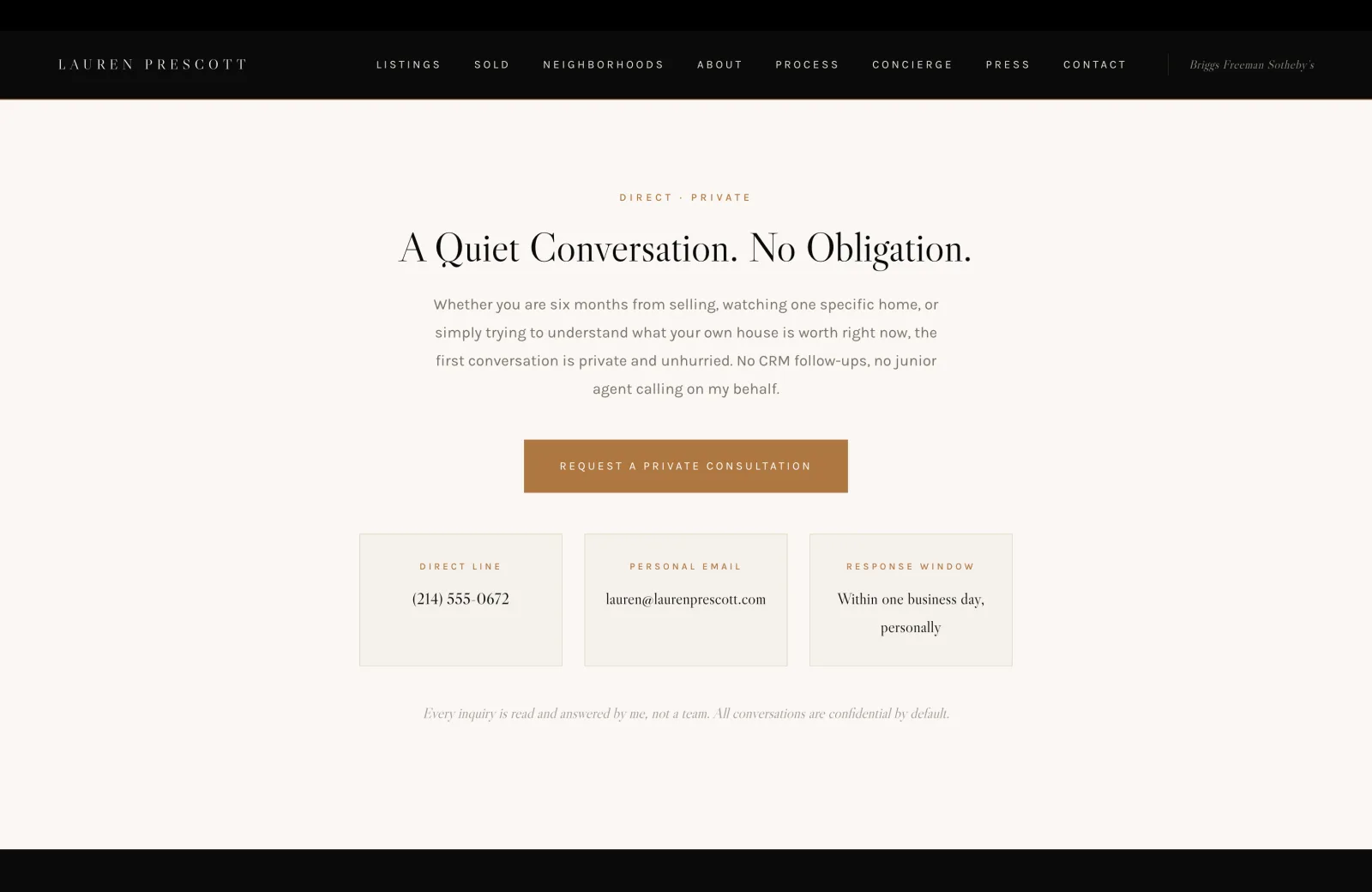
The contact section is where most agent sites break the promise the rest of the site has been making. After three pages of "intentionally small" and "personal practice," the buyer hits a contact form with seven required fields and the sinking feeling that they are about to enter a CRM.
So I did not put a form here. The section has three bordered cards instead: Direct Line with a phone number set in formal serif, Personal Email with the agent's address, and Response Window with "Within one business day, personally." The primary CTA above ("Request a Private Consultation") goes to a private intake, but the three cards beside it tell the buyer the form is not the only path. They can call. They can email. They can know the response window before they reach out.
The italic line at the bottom is the architecture of the entire site in one sentence: "Every inquiry is read and answered by me, not a team. All conversations are confidential by default." A buyer who has been routed through three brokerage assistants in the last six months reads that line and exhales. The next move is a phone number, not a form.
TREC Disclosures
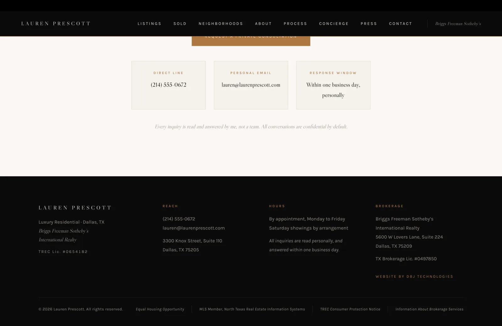
The footer is a credibility surface. A buyer who scrolls past it will not read every line, but the regulator, the auditor, and the sophisticated buyer who knows what to look for will find every required item exactly where they expect it.
The full disclosure stack lives here, set quietly in the muted brand color so it reads as professionalism rather than fine print. Brokerage name (Briggs Freeman Sotheby's International Realty) and address. TREC license number for the agent. TX Brokerage license number for the brokerage. Hours by appointment. A reminder that all inquiries are read personally and answered within one business day. The bottom strip carries Equal Housing Opportunity, MLS membership, the TREC Consumer Protection Notice, and the link to Information About Brokerage Services. Nothing is hidden behind a "Legal" link. Everything a Texas residential agent is supposed to display is exactly where a regulator or buyer expects to find it.
The "Website by DBJ Technologies" credit closes the right column without competing for attention. This is what a practice running quietly at the top of the market looks like in its footer: comprehensive, calm, and unmistakably built by someone who has read the TREC Advertising Rule and the Information About Brokerage Services notice in full.
Build It For Real
Want this architecture, executed for your practice?
I build the version of this that ships. Designed end to end, launched on production grade infrastructure, with the surfaces above tuned to your actual book of business.