What a healthcare buyer actually needs from your site in the first ninety seconds
A healthcare buyer is rarely casual. They are choosing a dentist because a tooth chipped on Tuesday, or choosing a doctor because a referral expires Friday, or choosing a specialist because their primary just gave them a diagnosis they did not understand. The emotional state is anxiety, and the anxiety is the conversion blocker.
The five questions a healthcare visitor needs answered before they will pick up the phone are: can you see me soon, do you take my insurance, what does this actually cost, who is going to be in the room, and have other people like me had a good experience here. The site that answers those five questions above the fold gets the appointment. The site that buries any of them behind a contact form loses to the next listed competitor.
The mobile context is heavy. Pew Research reports that ninety-seven percent of American adults own a cellphone and ninety-one percent own a smartphone (Pew Research, 2024). Healthcare searches happen disproportionately on phones, in waiting rooms, in parking lots, between meetings. A site that requires desktop-grade scrolling to find a phone number is a site that loses appointments.
HIPAA, regulatory considerations, and the trust premium
Healthcare websites are not generic marketing sites. Any form that collects personally identifiable information combined with health context (a contact form that asks for a name, an email, and the reason for the visit) creates Protected Health Information under HIPAA, which means the form processing, the email transport, the database, and every third-party vendor that touches the data must be covered by an executed Business Associate Agreement (HHS Office for Civil Rights, 2024). Most off-the-shelf form providers do not offer a BAA at the price tier service businesses default to, and most healthcare site implementations are quietly out of compliance for that reason.
The right architecture treats HIPAA not as a paperwork layer over a normal site but as a design constraint that shapes which features ship and how. End-to-end encryption on form submission. A vendor list with a BAA in place for every entry. A privacy policy that names the actual data handling, not boilerplate. A breach response plan the office can actually execute. None of that is glamorous, and most of it is invisible to patients, but a HIPAA violation is the kind of fine that closes a practice.
Beyond HIPAA, the trust premium in healthcare runs on identity. Patients want to see the practitioner's face, the practitioner's name, the practitioner's credentials with the issuing body named. Stock photography of an unrelated dentist or doctor is worse than no photography, because patients have learned to recognize the pattern and read it as a red flag. The trust block on a healthcare site is named, dated, and verifiable, with links to actual review sources rather than testimonial excerpts that cannot be checked.
What I see most healthcare sites get wrong
Five mistakes I see in nearly every healthcare site audit. The first is hiding the appointment path. Patients arrive with intent; the site should make booking easy. A real phone number in the header, a sticky mobile call button, a prominent appointment-request form, and ideally an online scheduling integration. Burying any of these behind a contact form is overthinking.
The second is treating insurance as private. The most common patient question after "can I be seen today" is "do you take my insurance." The answer should be on the site, named, current, and verifiable, not a generic "we accept most major insurance plans." The patient who has just been burned by a surprise bill from another office reads generic insurance language as a red flag.
The third is hiding price entirely. Healthcare pricing is legitimately complex, but the site can still anchor honestly: a new-patient visit price for a dental practice, a self-pay rate for an uninsured medical visit, a membership plan for cash-pay patients. Practices that publish even a partial price list outperform practices that publish nothing. The patient is looking for a signal that you are not going to surprise them, and a real number is that signal.
The fourth is fake-feeling proof. A wall of generic five-star quotes with first names only reads as fabricated. The trust block that works in healthcare links to the actual Google Business Profile review page, the actual Healthgrades or Zocdoc profile, the actual credentialing body for the practitioner's specialty. Stock testimonials are worse than no testimonials.
The fifth is generic stock photography. A dental practice that uses an iStock dentist photo on the about page reads as a practice that is hiding something. Real photography of the actual practitioner, the actual operatory, the actual front desk, on a real day, by a real photographer, is the differentiator. The cost of one photo session is dramatically less than the cost of looking like every other healthcare site.
Design principles that actually convert in healthcare
Six principles, in priority order. The first is the appointment path is the primary CTA, and it lives in the header, the hero, a sticky mobile bar, and at the bottom of every long page. Healthcare buyers are not browsing; they are deciding.
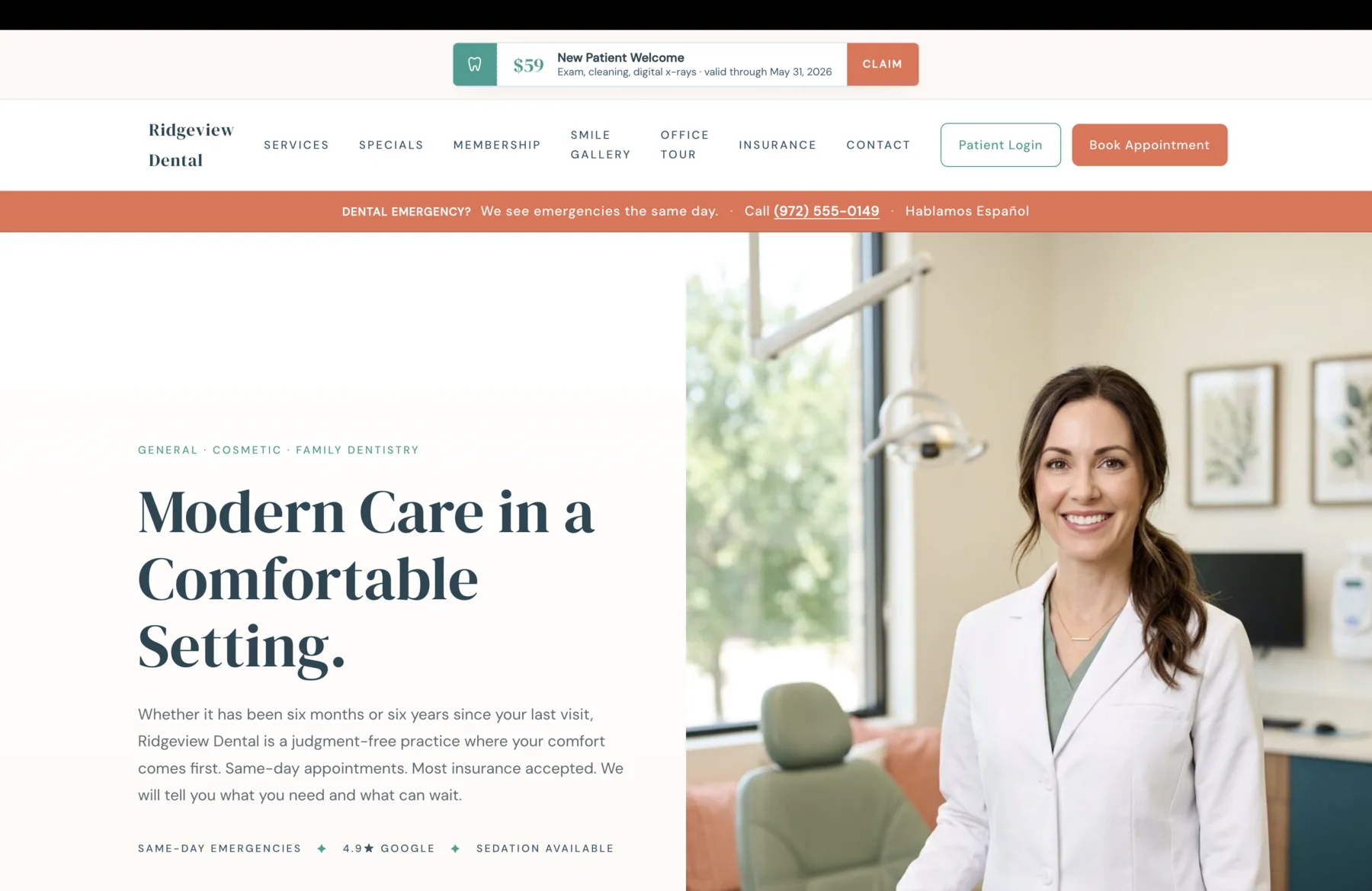
The second is the trust band runs in the first screen, before the services grid. On the Ridgeview dental brief I wrote, the trust band on the second screen names four confidence signals: same-day emergencies, in-network insurance, a 4.9-star Google rating, and sedation available. None of those are services; each is a question the patient came to verify. The band earns the right to keep scrolling.
The third is services are described by outcome, not procedure code. Preventive cleanings and exams paired with gentle hygienists who actually listen outperforms D0150 Comprehensive Oral Evaluation by an order of magnitude, because the former is the actual outcome the patient is buying and the latter is internal billing language.
The fourth is the first-visit walkthrough. Dental and medical anxiety is dominantly a fear of the unknown. A step-by-step walkthrough of what happens at the first visit (paperwork sent ahead, comprehensive exam, treatment conversation, cleaning same day if time allows) reduces the unknown faster than any reassurance copy can.
The fifth is named practitioners. Our team is a weak signal; Dr. Sarah Parker, DDS, family dentistry, ten years in West Plano is the strong one. Patients are choosing a person, not an LLC. The named-doctor surface beats a generic team page on every conversion metric I have measured.
The sixth is the page loads fast on a mid-tier mobile device on a slow connection. Lighthouse score in the high nineties on real hardware, Core Web Vitals passing at the seventy-fifth percentile in field data (Google web.dev, 2024). I cover the technical specifics in Core Web Vitals Explained for Service Businesses.
Ridgeview Dental: a published design brief that names every surface the practice needs
The design brief I wrote for Ridgeview Dental, a West Plano family practice, is one of eight published reference architectures in the Design Briefs library. It is not a finished site; it is the architectural reference that explains what every surface should do and why. Each surface in the brief is named, photographed, and explained: the calm same-day emergency band that runs across the navigation, the dated specials card with real expiration dates and no promotional codes, the Smile Plan membership published in full pricing detail, the four-step first-visit walkthrough that names what happens in the chair, the named-doctor surface that opens with Dr. Sarah Parker and her actual credentials.
The brief is the level of architectural depth I bring to a real engagement. It is also a literal reference: when a dental practice in DFW hires me, the work starts from something close to this brief, tuned to that practice's actual specialties, insurance list, and community. The Ridgeview brief is not a template; it is a thesis on what a modern family dental practice site should be, written in enough detail that any competent engineer could ship from it.
The same architectural depth applies to medical practices. The trust signals shift slightly (the credentialing body differs, the insurance list looks different, the scheduling integration is usually different), but the underlying principles hold: appointment path, trust band, outcome-named services, first-visit walkthrough, named practitioners, fast performance, accessible design.
The cousin verticals to healthcare in regulatory weight are law firms, where State Bar advertising rules shape every page, auto service shops, where the trust deficit is generational rather than regulatory, and trades and HVAC contractors, where licensing rules and emergency-call urgency shape the layout. The constraints are different; the architecture responds to them.
Common questions
What buyers ask before signing
Next step
If your practice is ready for a real site, the first step is a 30-minute call.
I do not run pressure sales. The first call is diagnostic. The goal is to confirm whether a custom build is even the right call for your practice, what scope of engagement makes sense, and what timing looks like on both sides. If the project is not a fit, I will say so and recommend a better path. If you want a fast first read on what your current site is leaving on the table, run a free Pathlight scan against your live URL before the call.
Sources
- 1.U.S. Department of Health and Human Services, Office for Civil Rights. (2024). HIPAA for Professionals: Privacy and Security Rules. https://www.hhs.gov/hipaa/index.html
- 2.Centers for Medicare and Medicaid Services. (2024). HIPAA Basics for Providers: Privacy, Security, and Breach Notification. https://www.cms.gov/training-education/medicare-learning-network/newsletter/2024-09-19-mlnc
- 3.American Dental Association. (2024). ADA Practice Resources and Code of Ethics. https://www.ada.org/resources
- 4.Pew Research Center. (2024). Mobile Fact Sheet. https://www.pewresearch.org/internet/fact-sheet/mobile/
- 5.Google web.dev. (2024). Core Web Vitals: thresholds and 75th-percentile measurement. https://web.dev/articles/vitals
- 6.W3C. (2023). Web Content Accessibility Guidelines (WCAG) 2.2. https://www.w3.org/TR/WCAG22/
Author
Joshua Jones runs DBJ Technologies, a solo studio building websites and applications for service businesses across the Dallas-Fort Worth metro. Last reviewed May 5, 2026.